summary
Dealer Specialties (DS) provides custom vehicle merchandising services such as interior and exterior photography, interactive 360° reports, videography, detailed vehicle condition reports, and inventory management Saas apps among other dealership services.
Dealer Specialties' Lot Technicians / Photographers (Users) rely on the C.A.R.Score app daily to capture vehicle photos, conduct inspections, generate 360° spins in tandem with the Spin360° app, and manage their daily workload. However, the app’s interface and user experience had remained unchanged for several years, becoming increasingly outdated. After years of focusing on other applications and business priorities, it was time to modernize the CARScore app.
mission
To resolve key pain points, modernize the CARScore app’s light and dark mode interfaces, enhance account accessibility, and elevate the overall user experience. To achieve this, I conducted a comprehensive heuristic evaluation, and conducted a few user interviews alongside Product Management.
Every change shown on this page was designed for both iOS and Android; however, for the sake of brevity, I’m going to show mostly iOS examples.
Let’s see the main UI improvements first and then the specific UX improvements:
UI specific
app identity issues
Users primarily rely on three key apps: C.A.R.Score (Mobile), VINMotion (Mobile), and RapidLot (Tablet View Only).
VINMotion and RapidLot are typically used in tandem while working across different dealerships, as they serve similar roles and functions. The choice between them depends on the specific use case and service.
C.A.R.Score, on the other hand, is used by specialized teams focused on dealership photography and inspection services.
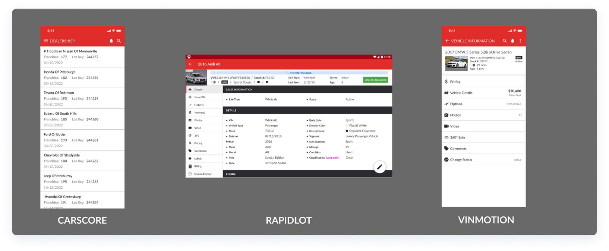
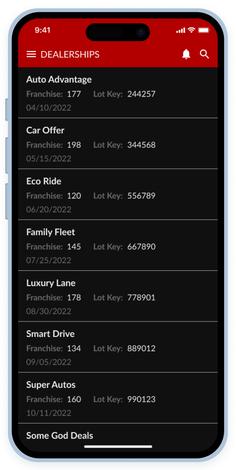
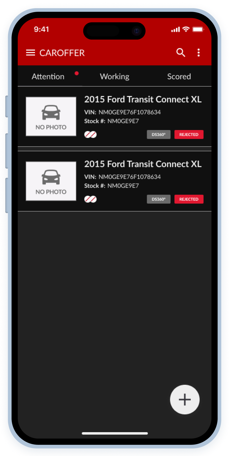
- Before: Users complained that at a glance, they did not know which app they were looking at sometimes, especially the mobile apps, and... can you blame them?
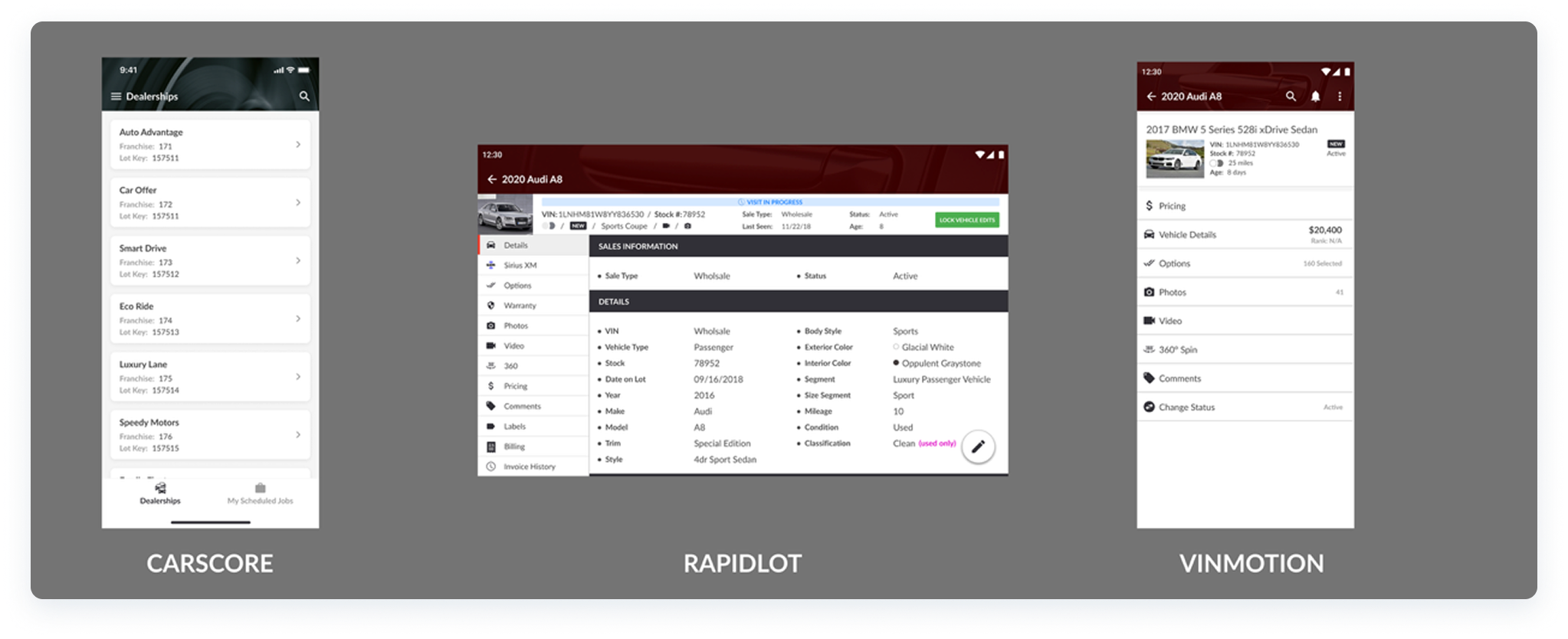
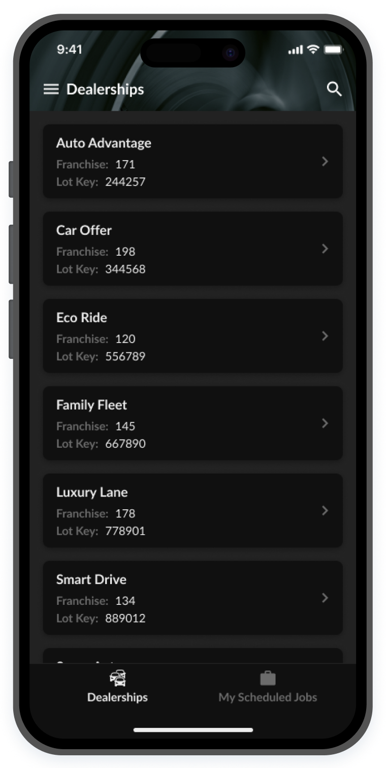
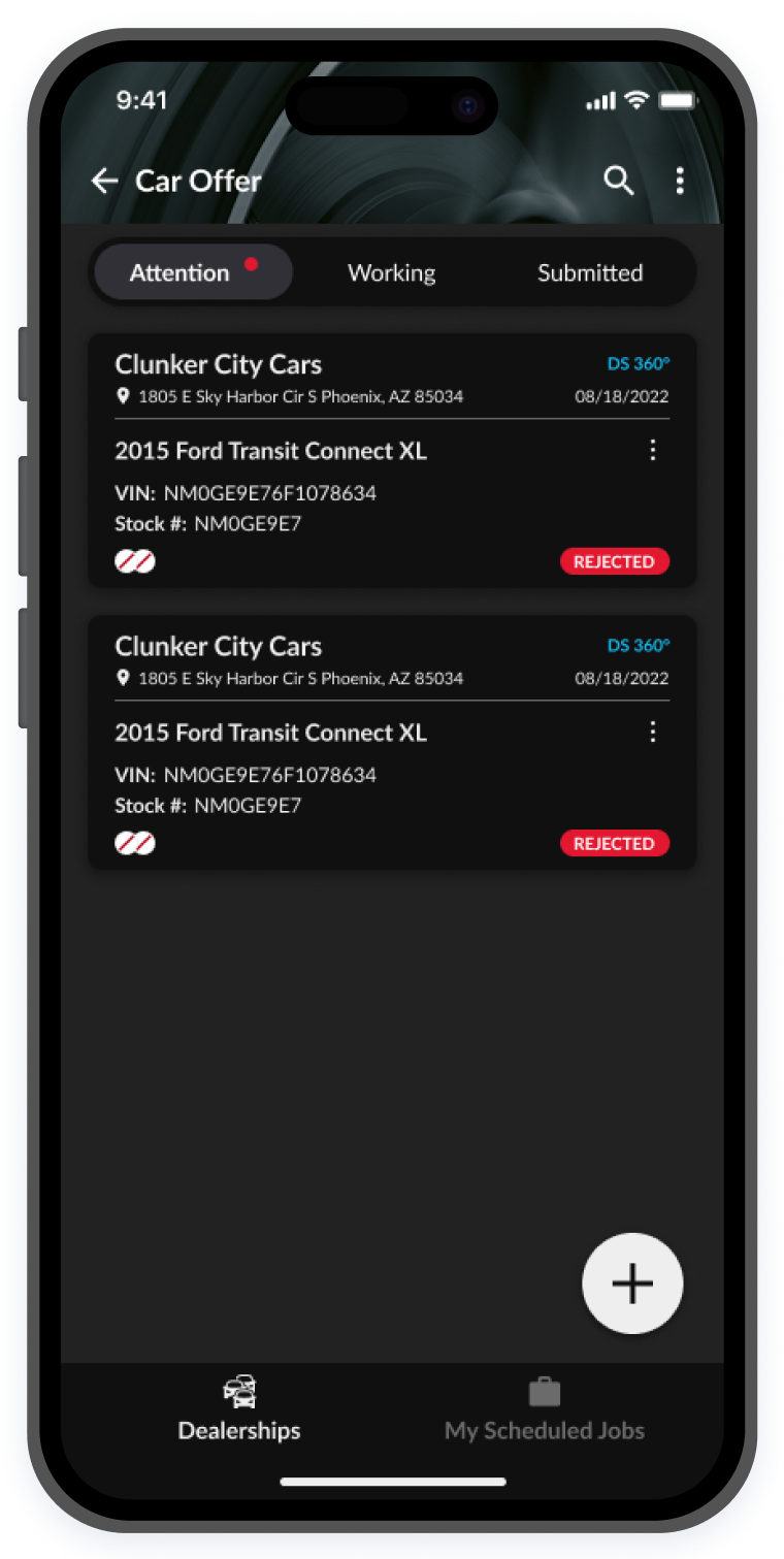
- After: The RapidLot and VINMotion apps were given the same header style, and C.A.R.Score was given a different one, eliminating this pain point.
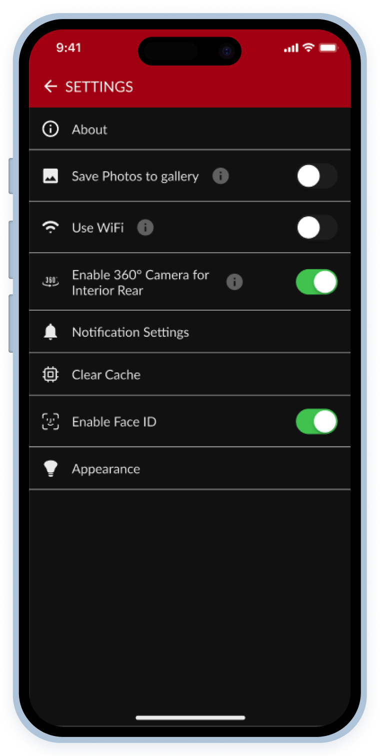
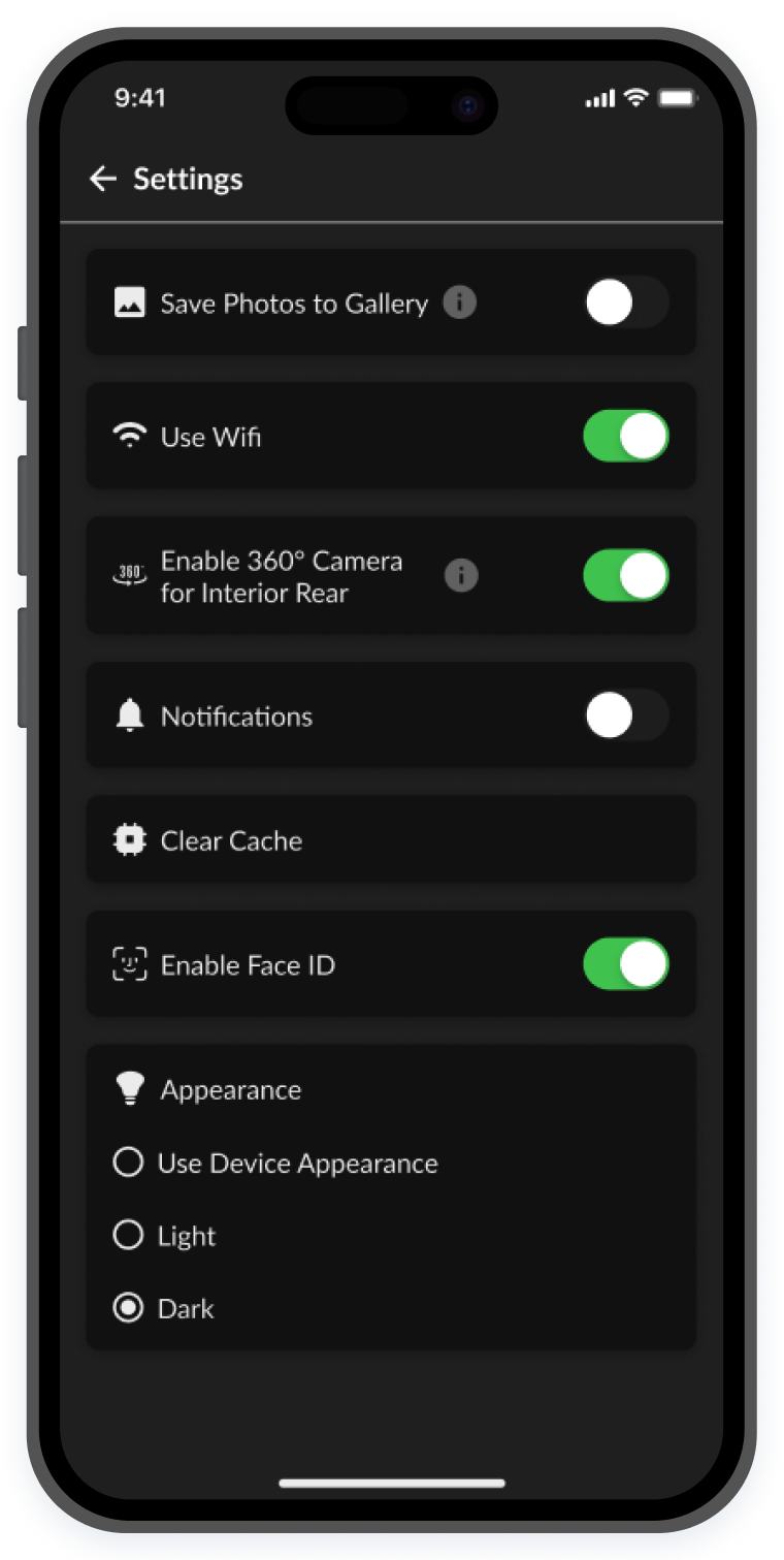
ACcessibility issues
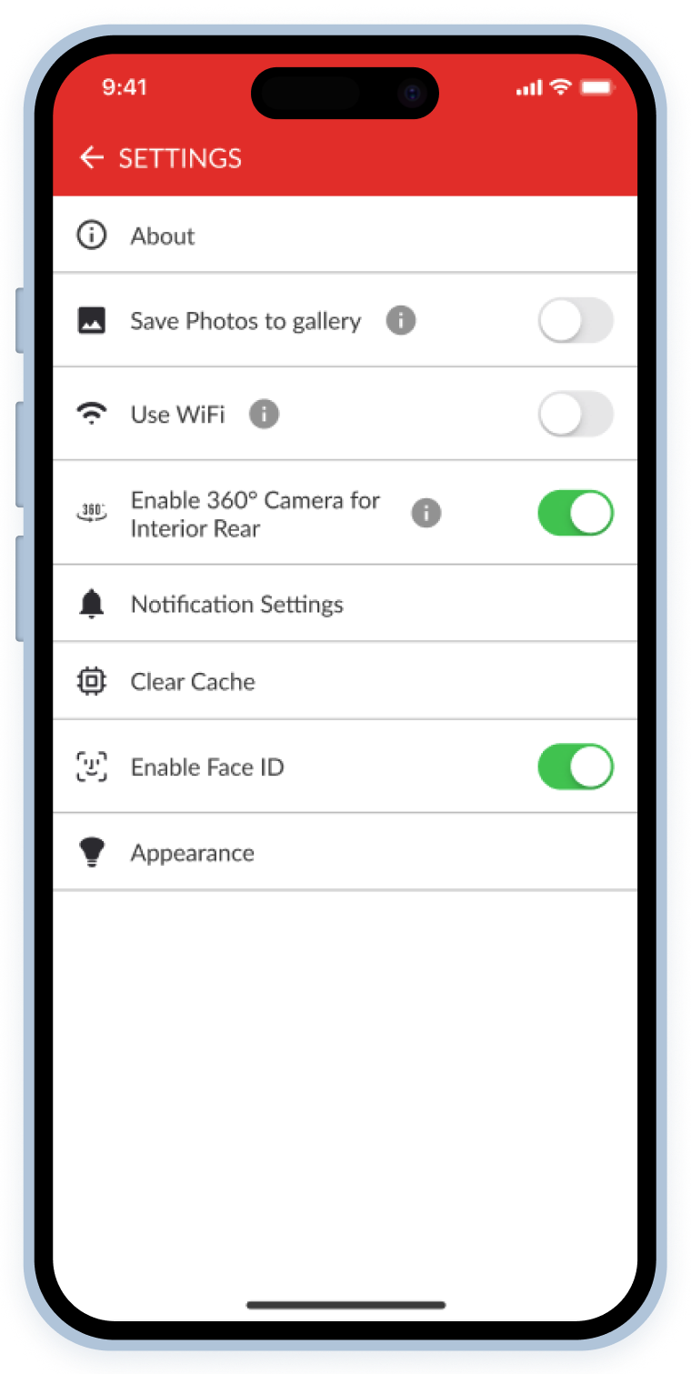
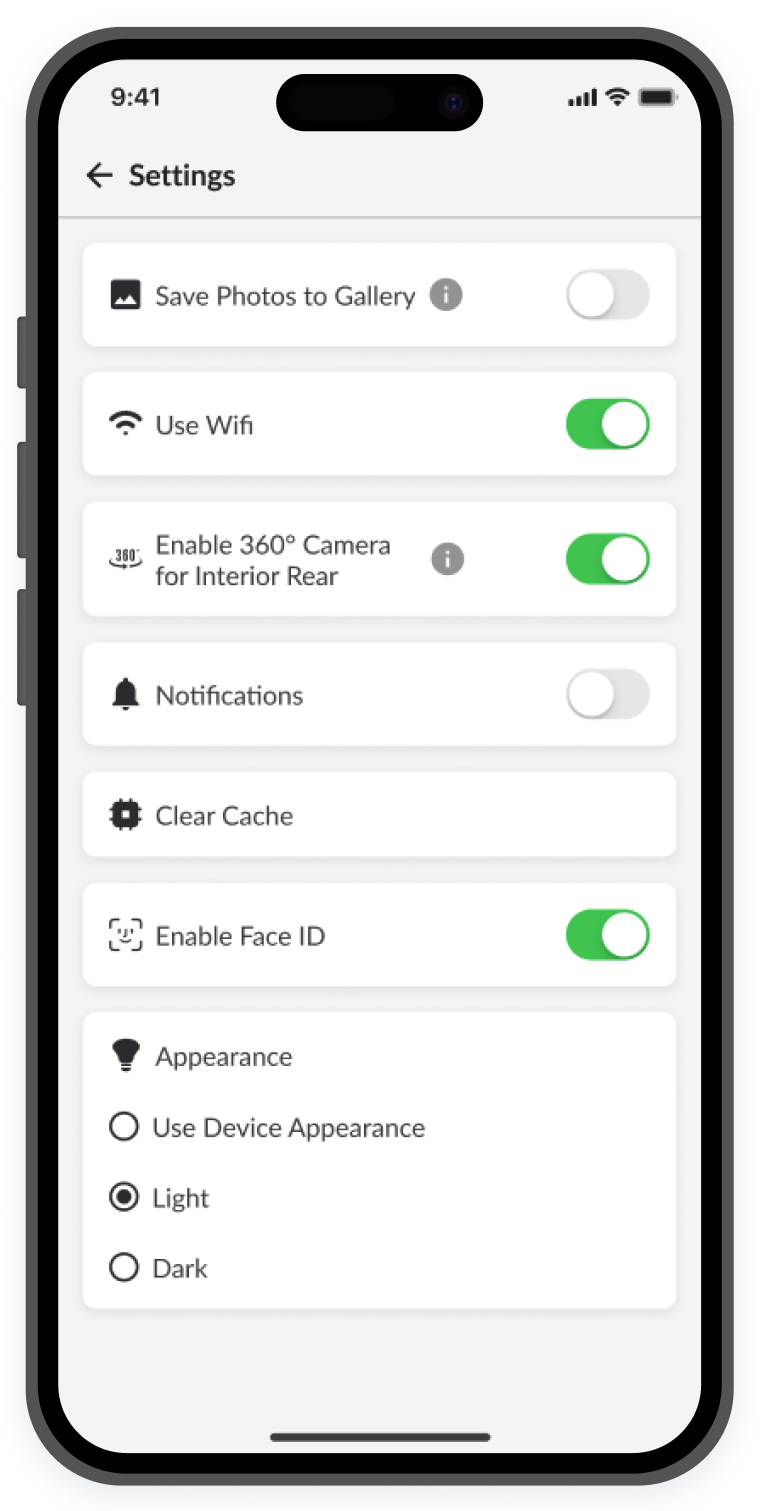
These apps had outdated UIs that failed to meet accessibility standards, making them difficult to use in real-world conditions. Since users often rely on them outdoors (Navigating dealership lots under harsh sunlight and other environmental challenges) screen visibility was a major issue.
Other things like typography in all-caps was also optimized for readability.

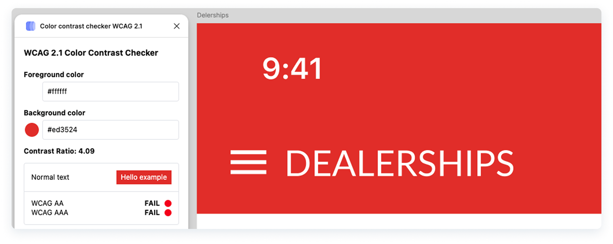
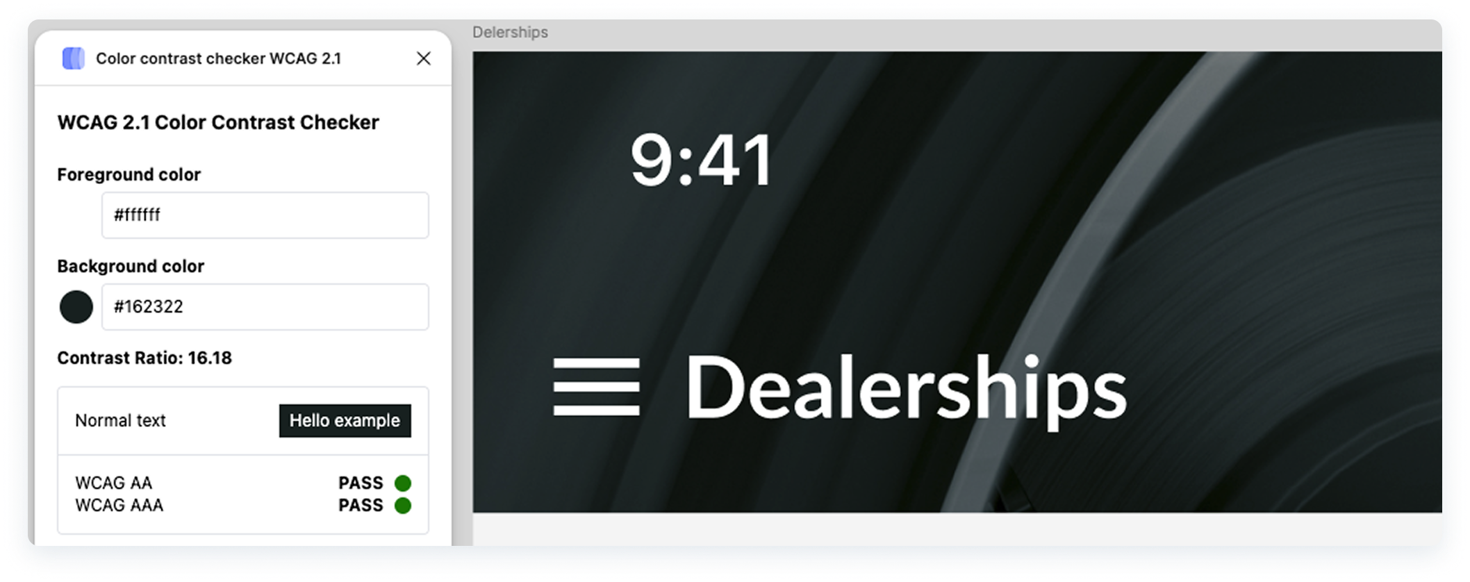
readability issues
Most elements lacked sufficient padding, didn’t pass contrast tests for accessibility, and didn’t follow overall UI best practices.
Here are some examples of both light and dark modes before and after the UI enhancements.
Ux specific
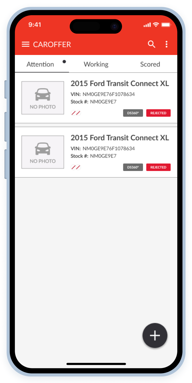
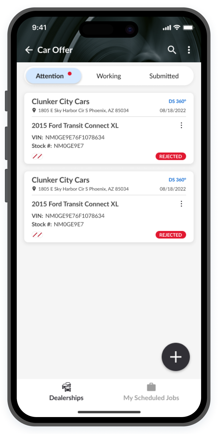
card readability
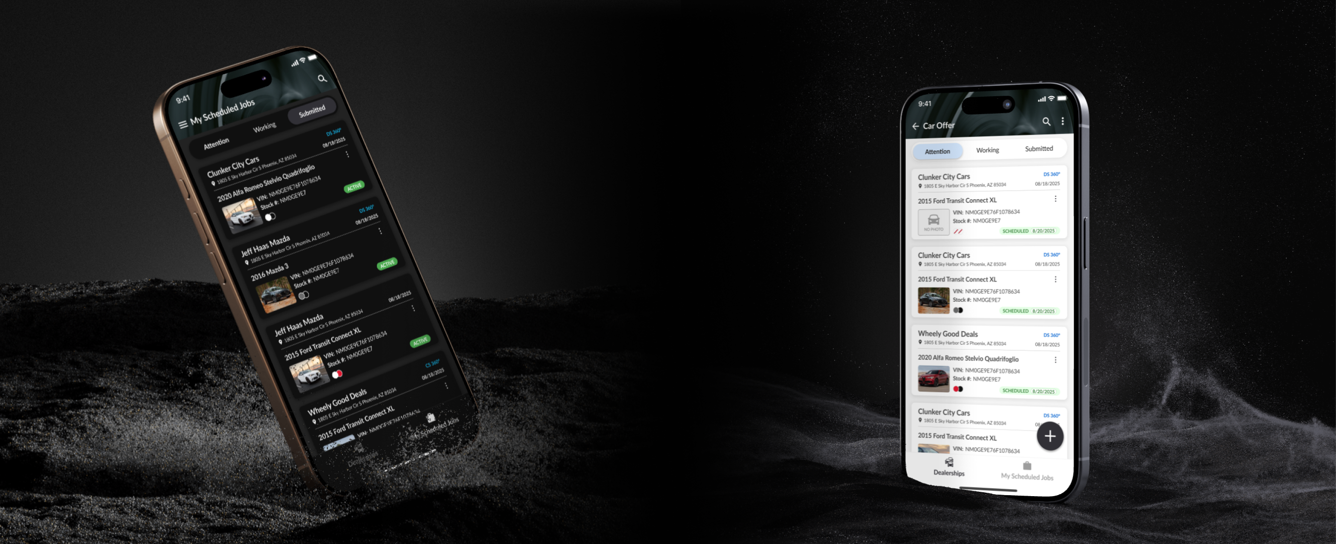
The vehicle cards represent each job that a Lot Tech needs to complete. They show important information such as the job date, location, vehicle and dealership information, job status and more.
The previous card design worked for our users, in fact they did not complain much about them; however there were lots of simple yet effective improvements to be made to improve their perceived usability as stated in the UX law of the Aesthetic Usability Effect.
I created detailed annotations, and relied on Figma variables, tokenized colors, instance swap properties, and other features that allowed me to create reusable and scalable vehicle card components.
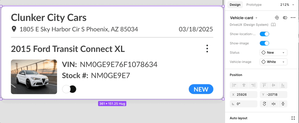
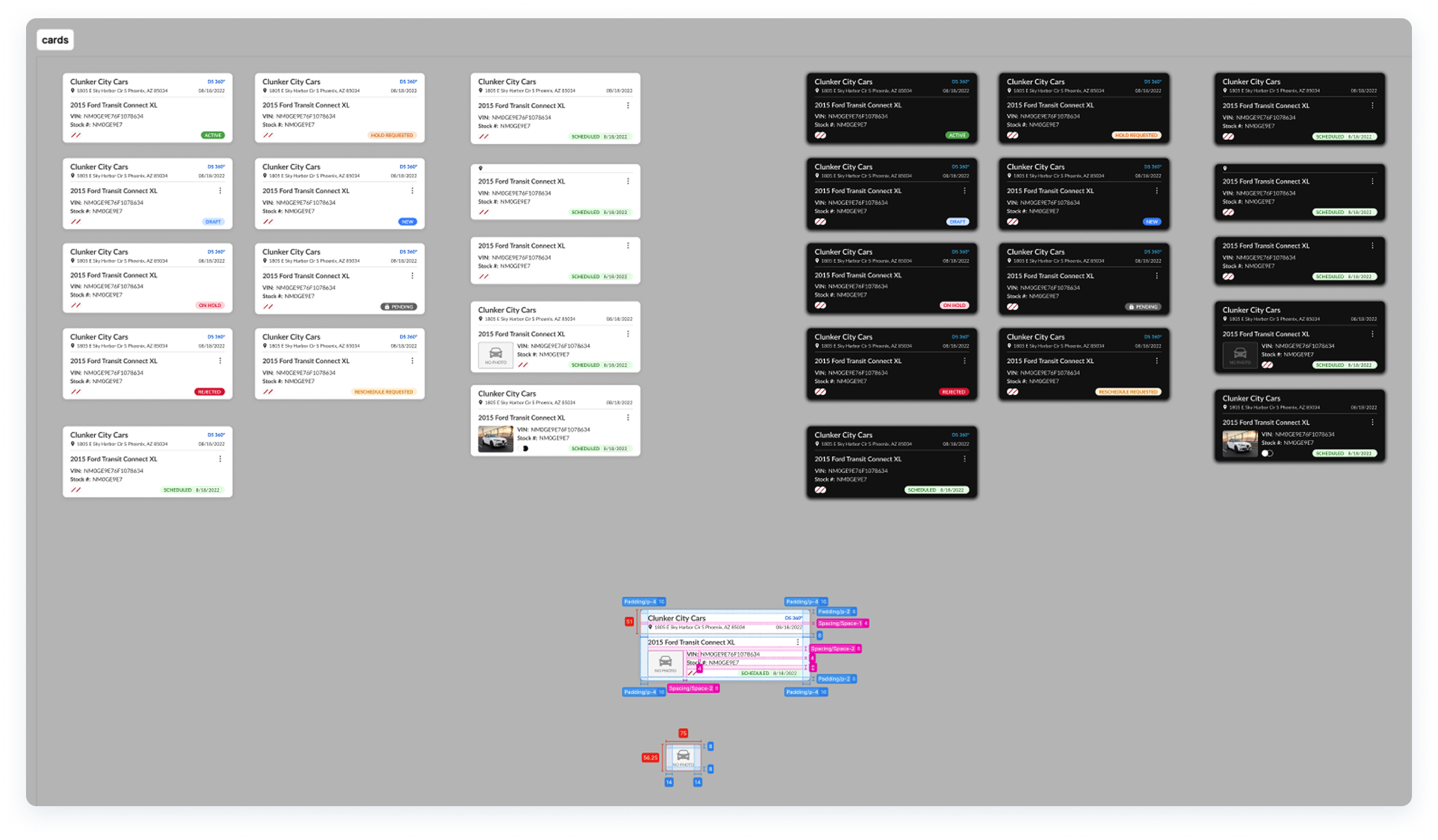
- These cards included both dark and light mode examples and annotations for the dev team to have a clear understanding of how to build them.
VIEWING THE APP VERSION
At times, when users need assistance from support regarding bugs or issues with the C.A.R.Score app, we found that 20% of the time, it is because they haven't downloaded the latest version. There are other ways to manage this issue, but this tends to happen more often than expected.
Users need to make sure they're running the latest version of the app and the previous setup had unnecessary pages buried under “Settings” adding unnecessary time and friction, and also extra weight and bloated code that could be trimmed down. I redesigned the flow, cutting it down from 3 taps to just 1.
This was also true for changing between light and dark modes.
- Before:
- 1st tap: Open menu
- 2nd tap: Open "Settings" (Hidden and unintuitive)
- 3rd tap: Open "About" and view app version
- After:
- 1st tap: Open menu and view version (Bottom Left)
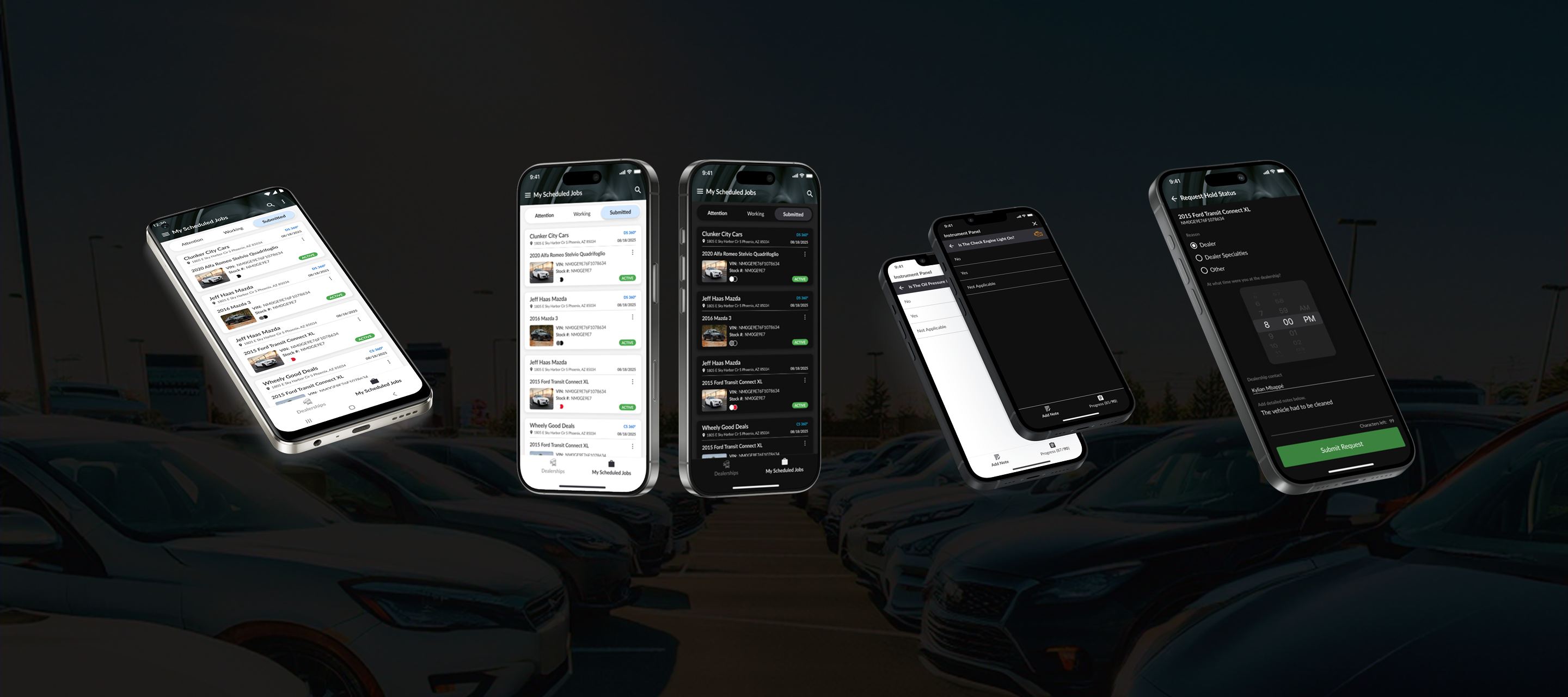
VIEWING SCHEDULED JOBS
Users reported having issues with knowing which jobs they needed to complete throughout the day. They currently get emails from their managers with lists of jobs that they need to complete, and it is up to them to find the specific dealerships on the C.A.R.Score app that they need to cover that day, and then find the jobs under each dealer.
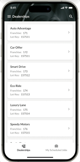
I fixed the need for so many unnecessary steps by introducing a bottom navigation option for a general “Dealerships” view, and a “My Scheduled Jobs” view.
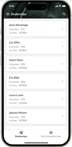
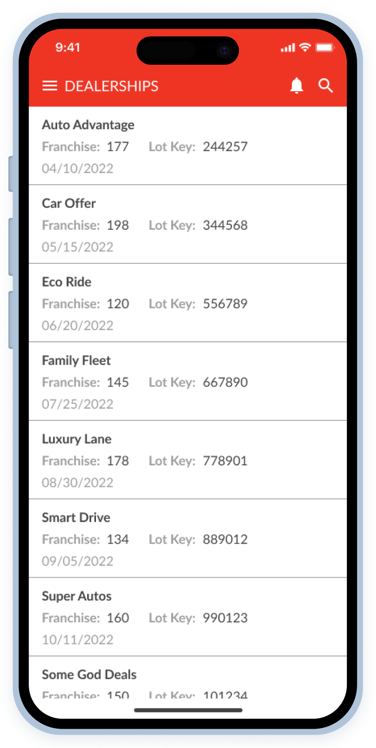
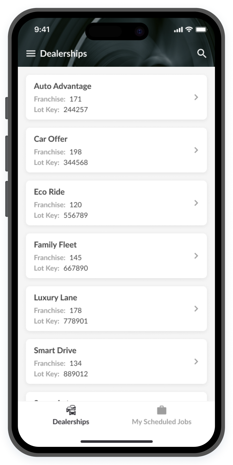
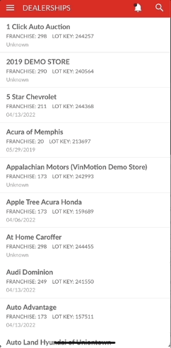
VIEWING Specific dealerships
To vIew a specific dealership, and then switch to another, users needed to tap 6 times. I cut this down to 3 by introducing very simple signifiers such as back buttons, and also a bottom navigation option for “Dealerships” specifically.
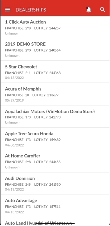
- Before:
- 1st tap: Open menu
- 2nd tap: Open "Delerships"
- 3rd tap: Select a dealership
- 4th tap: Open menu again
- 5th tap: Open "Dealerships" again
- 6th tap: Select another dealership (and so on)
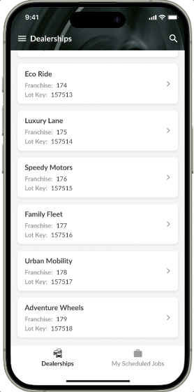
- After
- 1st tap: Select dealership
- 2nd tap: Go back
- 3rd tap: Select another dealership
By leveraging the Aesthetic Usability Effect, and following good UX best practices, simple changes go a long way. Our users' time navigating the C.A.R.Score app is now reduced, and their interaction with it is now more pleasant and perceived as better according to a pos-launch survey we ran, simply by incorporating these simple updates.
By streamlining the app and improving the user experience, Lot Technicians can complete more jobs efficiently, boosting their commissions and enhancing company revenue.