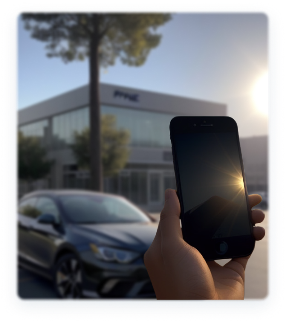
Dealer Specialties (DS) provides custom vehicle merchandising services such as photography, interior and exterior 360° images, videography, and detailed vehicle condition reports, among other vehicle dealership services. One of its main services is to provide vehicle inspections for auction partners for cars that belong in the wholesale market. These inspections are made through a mobile app called C.A.R.Score, which DS field representatives/photographers use on a daily basis to inspect vehicles outside on dealerships’ parking lots.
One of DS’ main sources of revenue comes from vehicle inspections by charging a fee per each vehicle that gets photographed / inspected. Representatives/photographers (our users for this project) are compensated for each vehicle that they service every day, and it was clear from the start that the C.A.R.Score app was adding time and friction to their daily tasks. It was imperative that we optimized this app’s UX to reduce time, help our users do their job faster and thus generate more commissions for them and revenue for the company as a whole.
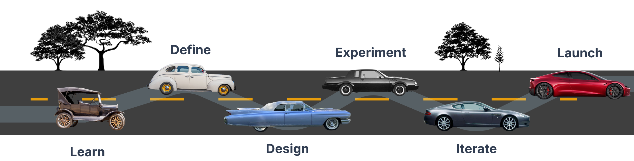
framework
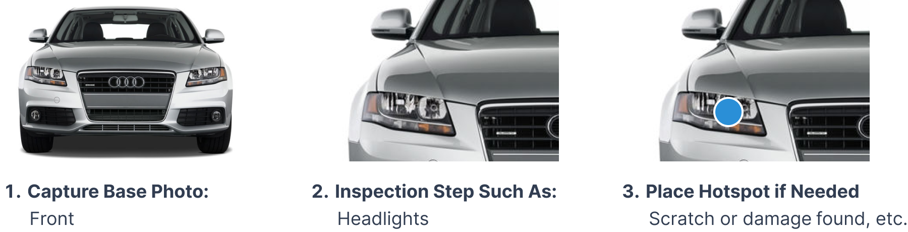
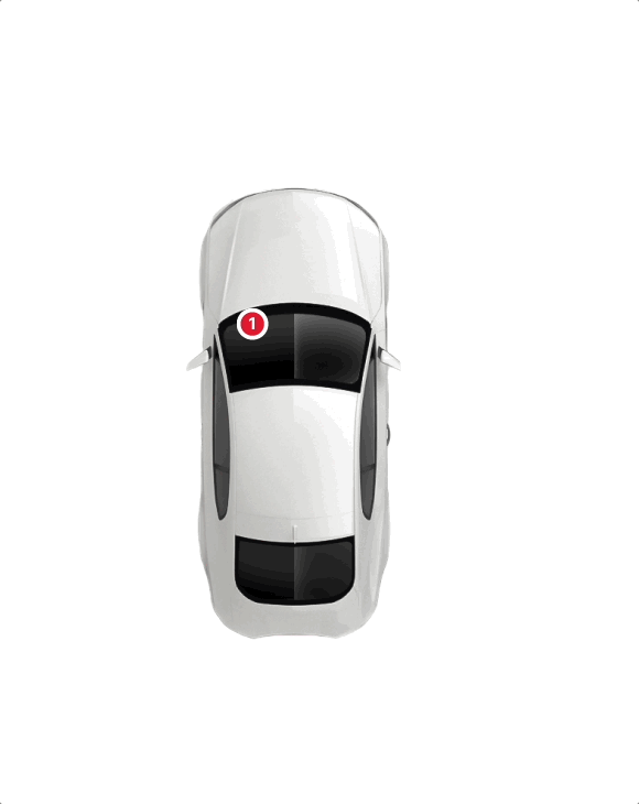
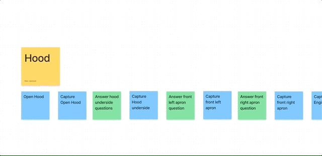
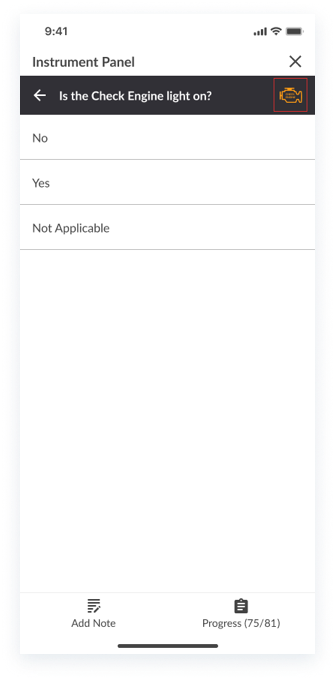
This feature of the C.A.R.Score app allows users to inspect a vehicle by capturing a base photo, for example the “Front” of the vehicle, and then following inspection steps for such base photo. In this case, an inspection point could be the headlights, hood, or grill among others. A user can then place a hotspot if there is visible damage to be reported such as a dent or scratch. This process repeats itself throughout the entire exterior and interior of the vehicle.
By discussing this project with Product Management and other DS stakeholders, it was evident that if we were able to improve this vehicle inspection experience, we could:
- Reduce turnover as our representatives/photographers (Users) would oftentimes leave the job because other competitors’ apps functioned better, and coming from an HR background, I knew how expensive employee turnover can be.
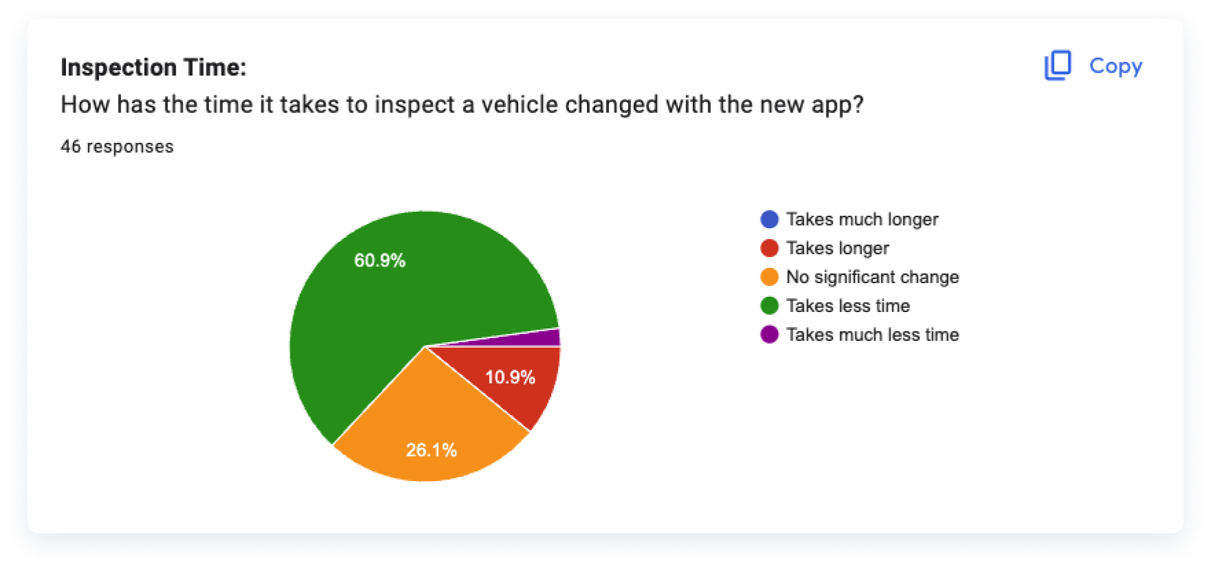
- Reduce the time it took to inspect a vehicle, allowing for more vehicle inspections to be completed and thus generate more revenue / commissions for our users.
- Create a better process for future employee retention strategies as our product became better and more efficient.
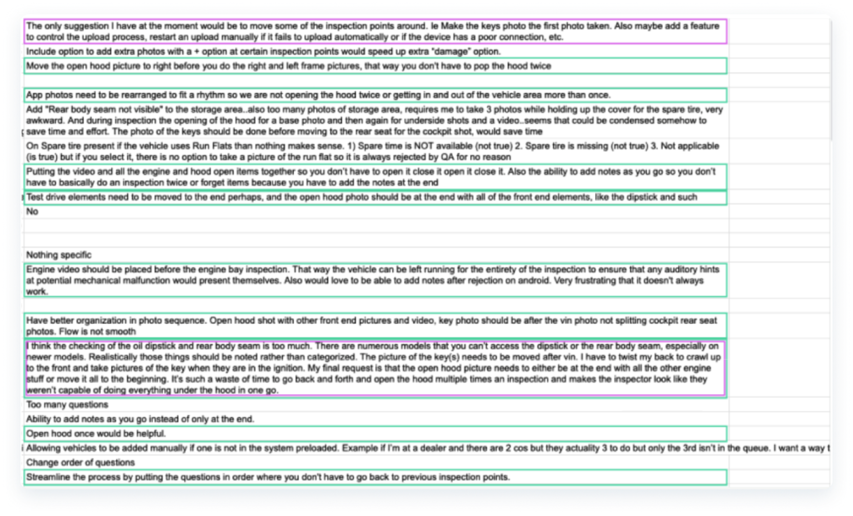
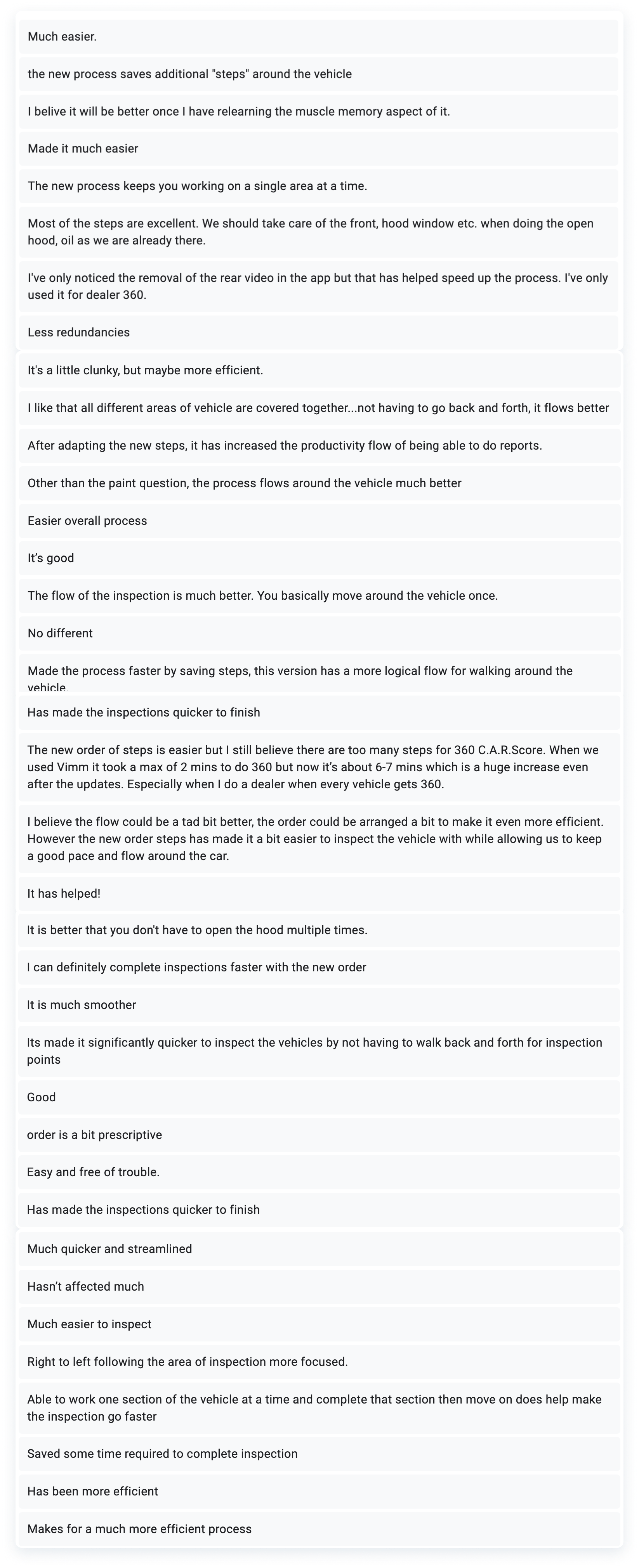
We interviewed our users to uncover and address their pain points. Starting with a survey that was shared with 50+ representatives/photographers, and later with in-person interviews with a group who generally had a high volume of inspections within the past 3 months, we were able to get qualitative and quantitative data about certain steps that weren’t optimal, the time it took them to complete a vehicle, and more.
- Average time it took to inspect a vehicle depended on multiple factors (type of vehicle, dealership parking lot accessibility, weather conditions, time of day, and more) but generally speaking, 30 minutes seemed average and users wanted this reduced.
- It was frustrating to have to open the vehicles’ hood multiple times to complete an inspection. One to capture a base photo of the engine, and later again to perform engine-related inspection steps. This pain point repeated itself throughout other steps.
- The workflow required lots of wasted movement in multiple directions around a vehicle making them require more time & effort than they should.
- Inspections were rejected by our QC team oftentimes because our users didn’t have a way to seamlessly add notes or comments to certain inspection points. This ability existed already but was not intuitive or easily accessible.
- Our inspector’s phones and devices run out of battery very quickly because they need to bump up the screen brightness to the maximum level to be able to see outside while dealing with sun glare and other factors.
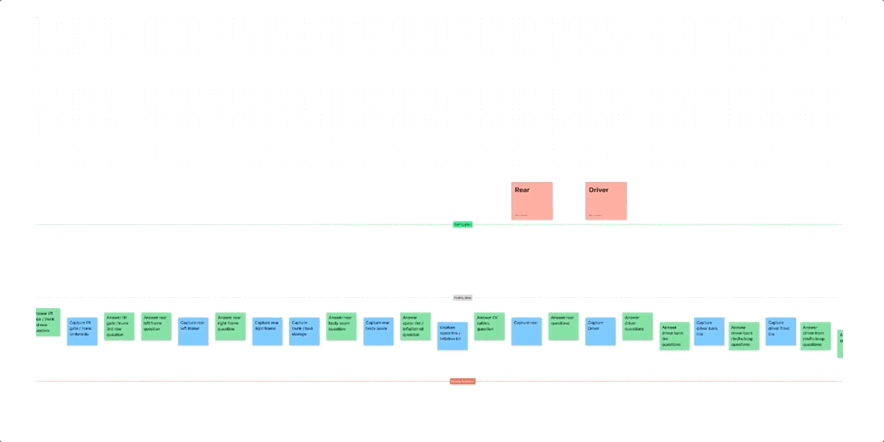
- Current Workflow: Each number represents a users’ movement around the vehicle. It demonstrates how repetitive the movements were and how it forced users to repeat spots or engage with friction points that added time and frustration to their job.
With pain points and recurring patterns identified, I analyzed multiple vehicle inspection videos as an outside source to find out about the best possible way to inspect a vehicle. Multiple ideas from different sources, combined with our users’ input, helped me create new potential solutions. Some included walking in a single specific direction around the vehicle, grouping all the hood photos and inspection points together, adding specific photos toward the start, and end of the experience, etc.
Since our users reported that their devices ran out of battery very quickly outside, because of their screens being set to the brightest level, I researched ways in which we could reduce this pain point.
According to researchers at Purdue University, it was found that “OLED displays draw between 44% and 73% of a phone's total power (averaged across the apps and devices) while in light mode at maximum brightness” and “... the switch from light to dark mode reduced a phone's power consumption by an average of 42% overall” while being at 100% brightness which is what our users tend to do while inspecting vehicles outside.
define
After analyzing the survey results and going through the current process myself to be able to empathize with our users further and understand their pain points, a journey map was created aiming to generate ides as a group and target specific pain points throughout the entire experience.
design
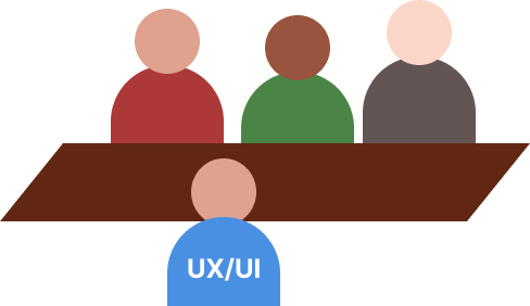
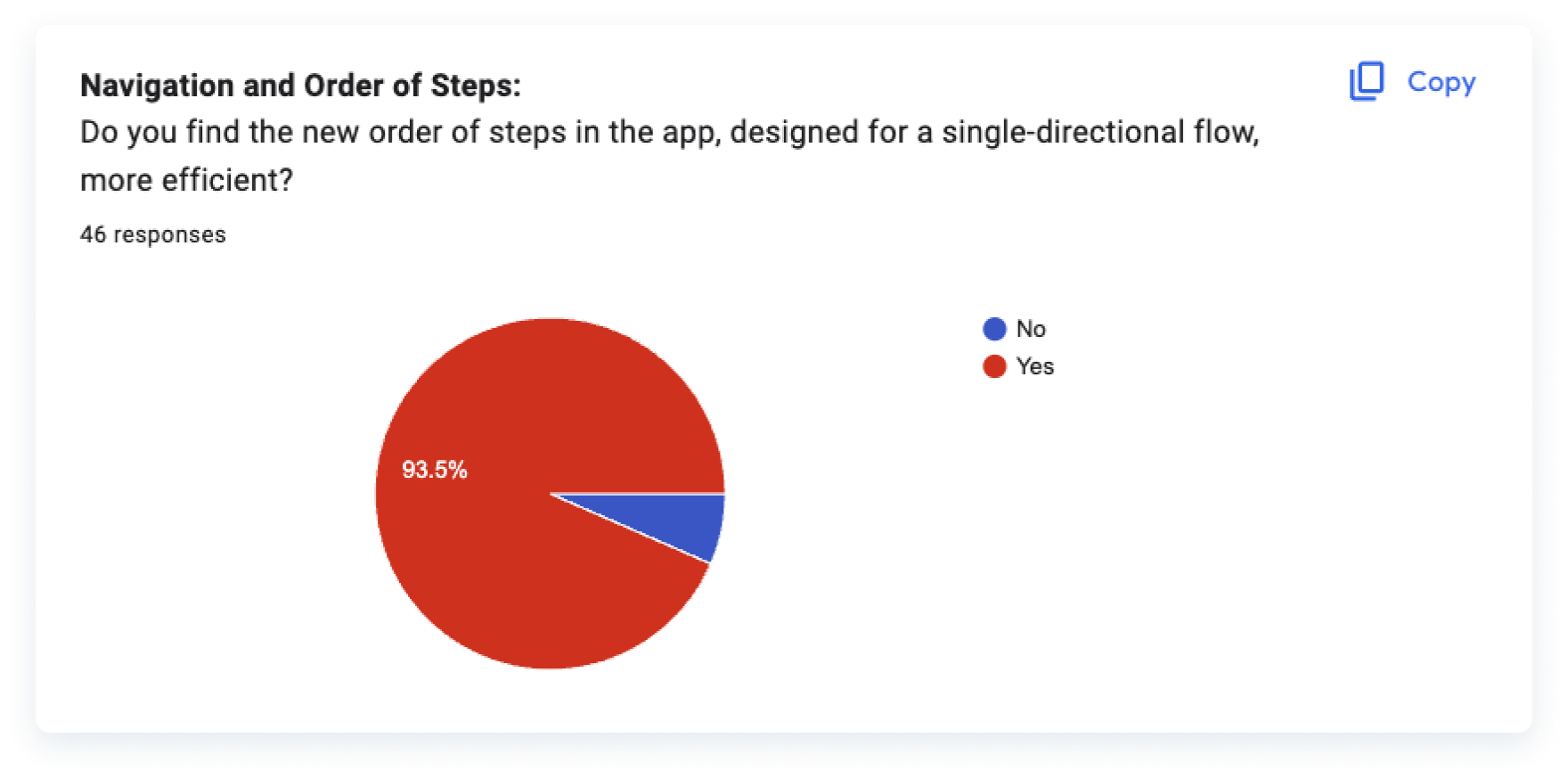
I, as the sole UX/UI Designer for this team, alongside Product, and some of our team’s Developers, engaged in a few sessions to ideate what would become the final and optimized step order for this project, which we were to call “V5”.
- The new workflow featured an optimized order of steps where users could walk in a single direction and inspect only one specific vehicle section at a time.
- Because our users work outside in dealership parking lots under extreme heat or extreme cold whether depending on their location and time of year, the interior inspection steps were left toward the end of the experience. This would allow them to benefit from AC or Heat while finishing their interior inspection flow.
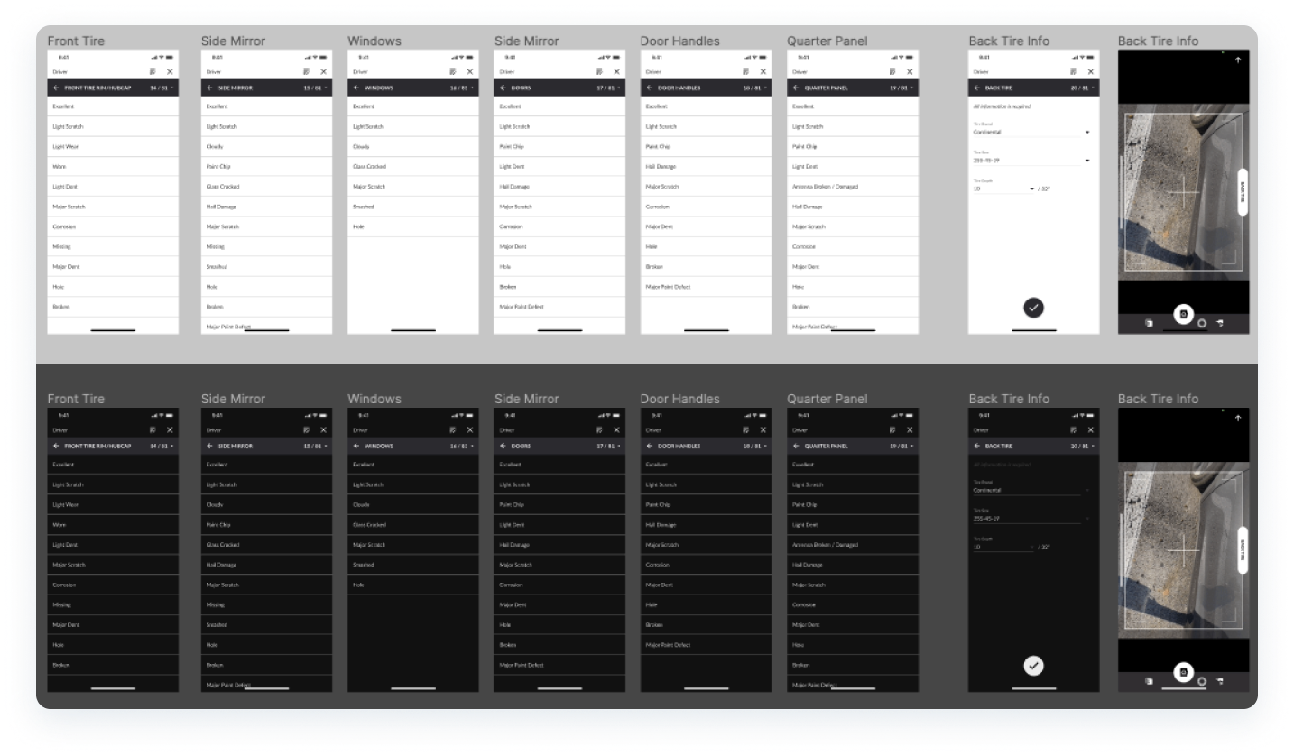
Since we did not have a dark mode in place for our C.A.R.Score App, I worked on designing a Dark Mode interface with Figma’s local variables and modes that could target this pain point, ensuring that every color met contrast and accessibility standards.
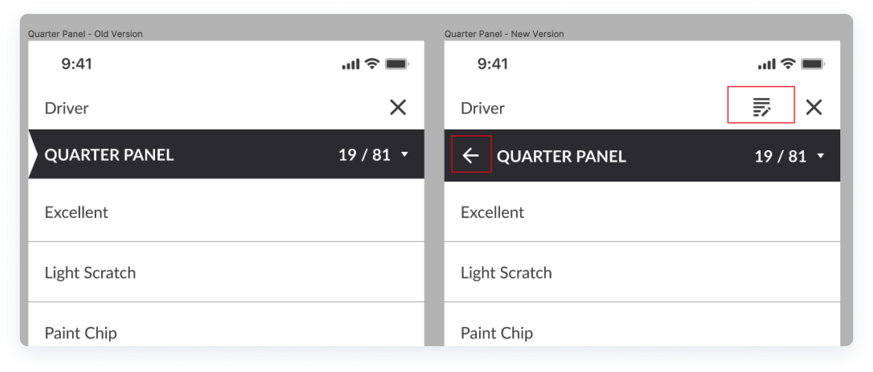
A new design for a notes section was added so our users could include specific notes to inspection points and avoid QC rejections for their inspections for missing notes. Also, a "back" button needed to be introduced since our users had reported issues with navigating through the inspection steps easily and issues with correcting errors or missed steps.
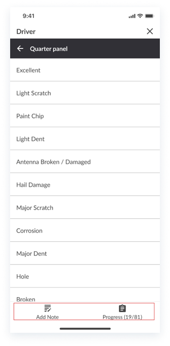
After testing and iterating, the final design included a bottom navigation for inspection steps and notes, as users frequently accessed the notes section, requiring a more convenient placement.
Additionally, this new space enabled the integration of images to support design heuristics such as "Recognition rather than recall", particularly for steps where users needed to identify active warning lights and understand exactly what to look for.
experiment
We tested our first iteration with our users through an Alpha release that was limited to a specific group of users who had been participating in this optimization effort from the start.
Through these experiments, we gathered valuable feedback, further refined the sequence of steps, and ensured we met user requirements while adhering to our initial KPIs, ultimately allowing us to launch a polished Beta app.
iterate
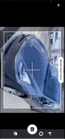
After testing our ideas with our test group, several inspection steps were moved from one base photo to a different one. This allows for an even more seamless experience and for other improvements such as inspection hotspots to be placed more accurately in the final inspection reports.
- Driver door(s), exterior mirror, and windows, were moved from the “Driver Front” angle, to “Driver”.
- The front undercarriage photo was moved from the “Driver Front" angle, to “Front”.
- The rear undercarriage was moved from the “Passenger Rear” angle, to “Rear”.

- Short demo of me going through the new and improved experience and feeling the workflow first hand.
launch
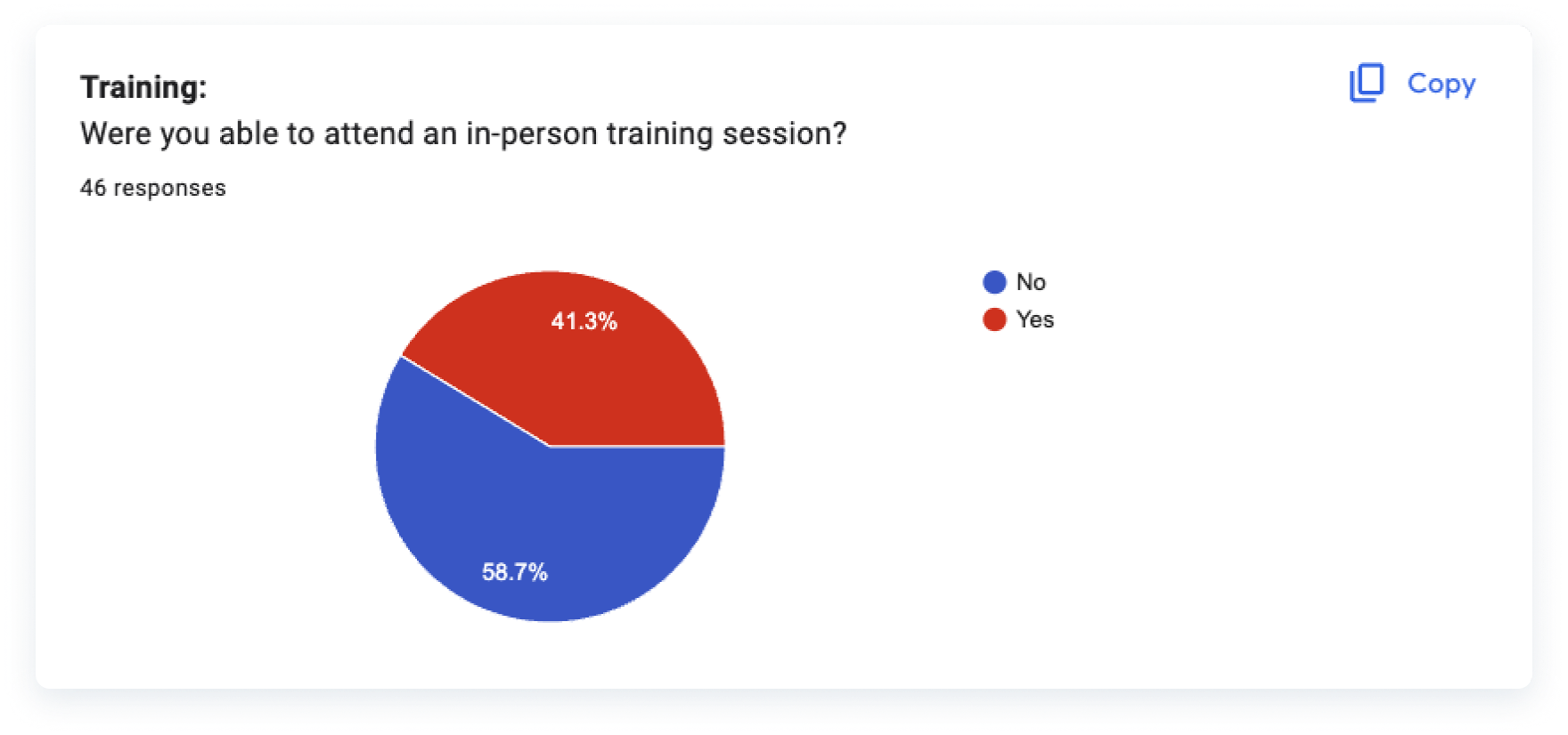
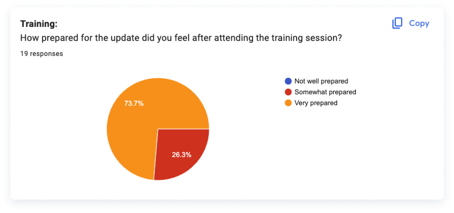
After our Beta release, our users had been using the new workflow for over a month. Besides providing release notes for our app’s new workflow, I assisted the Product team with creating training materials for our users since they had been using the same app for years and this was the first drastic change in their workflow.
Like in mostly every UX project, there is always going to be continuous growth. We continued to listen to our users and consider their suggestions for future improvements.
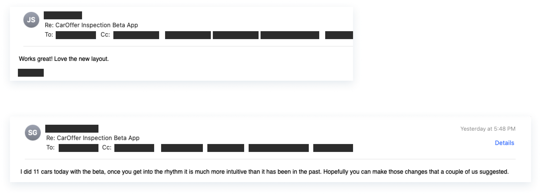
We reached out to those who had more to say and continued to consider ways to improve their experience. Overall, the field representatives provided positive feedback, and demonstrated their gratitude for being taken into consideration and listened to, something that they hadn’t felt in a long time at the company.
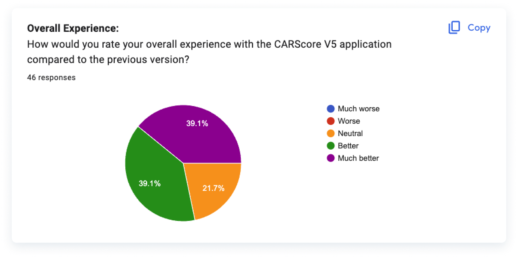
We also maintained a positive Customer Satisfaction Score (CSTAT) throughout all survey categories.