summary
OXARO is a Canadian company specializing in digital and advisory services for the public sector. Based in Ottawa, Ontario, they deliver customized solutions that adhere to stringent security, privacy, and compliance regulations. Formerly known as RCGT Consulting, OXARO focuses on bringing leading tools and technologies to Canada's public services, ensuring clients receive secure, scalable, and adaptable solutions.
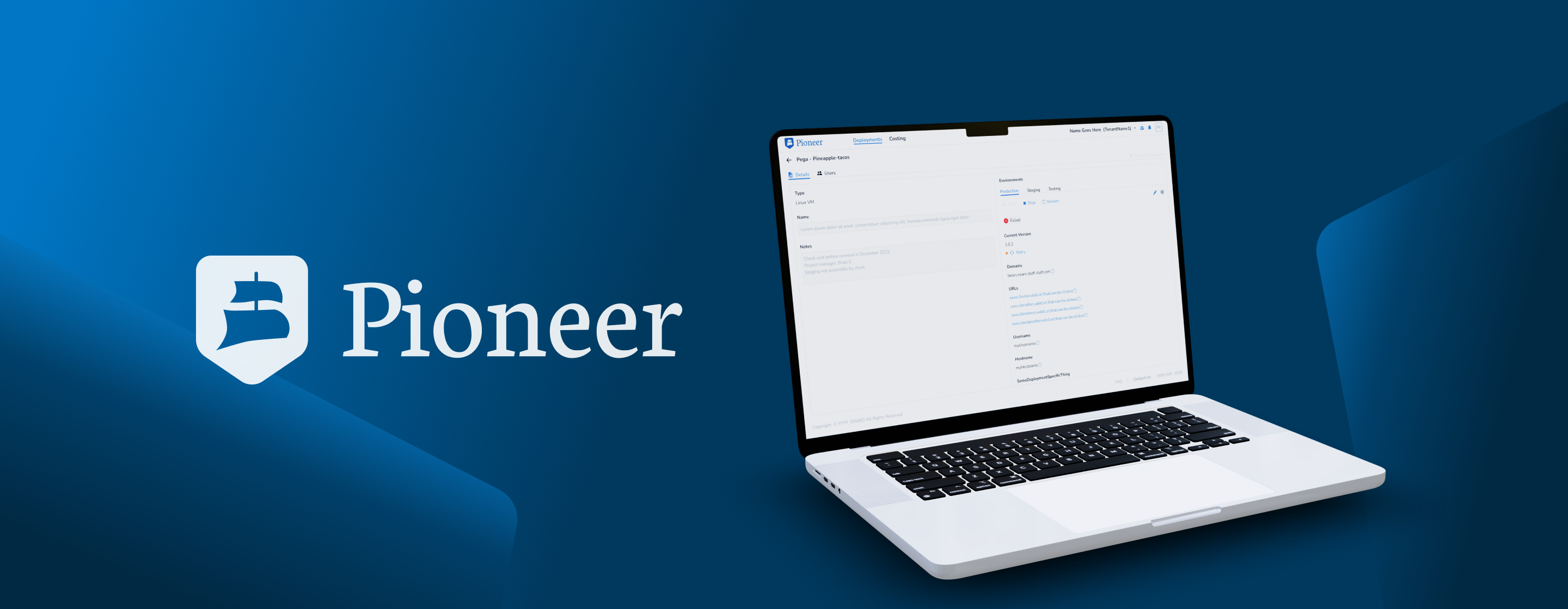
Pioneer is OXARO's internal multi-tenant deployment platform designed to streamline the deployment process across various environments such as “Staging” and “Production”. It enables different tenants to create and manage deployments efficiently, ensuring consistency and reliability throughout the software development lifecycle.
mission
I led the end-to-end UX/UI design for Oxaro’s Pioneer, crafting a 0 to 1 design from scratch. This included designing multiple screens, interactive mockups, a cohesive style guide, a custom logo, and a scalable UI framework to ensure a seamless and intuitive user experience. My work included a structured, visually consistent, and user-friendly foundation for their internal deployment tool.
results

product requirements
For confidentiality reasons, I will not be sharing Oxaro’s product requirement guides or specifications. However, throughout the process, I collaborated closely with the Oxaro Product team, participating in multiple interviews with key stakeholders, including their Product Manager, engineers, and developers.
wireframes
I designed multiple wireframes for their login experience, as well as the "Tenants," "Deployments," "Costing," and "FAQ" pages, among others.After testing, some concepts were refined based on user feedback and preferences. For example, the navigation was redesigned from a side panel to a top navigation for better usability.

style guide
After testing the wireframe concepts with the team, including Product Management, Engineers, and QA Engineers (end users) I created a style guide outlining the core color palette, typography, iconography, and other design elements.

high fidelity & Logo designs
With the style guide in place, I created high-fidelity mockups and prototypes, and designed Pioneer’s logo.


deployments
I designed the "Deployments" page to provide a high-level overview of each tenant’s deployments, displaying key metadata such as environment, deployment status, actions, name, and type. The page also featured a primary call-to-action (CTA), enabling users to effortlessly initiate a new deployment.


- Transient and final deployment status indicators
deployment creation wizard
This wizard utilized progressive disclosure and leveraged the Goal-Gradient Effect, ensuring users remained engaged and less overwhelmed when entering extensive information to create a deployment.


- Deployment editing screen before user testing

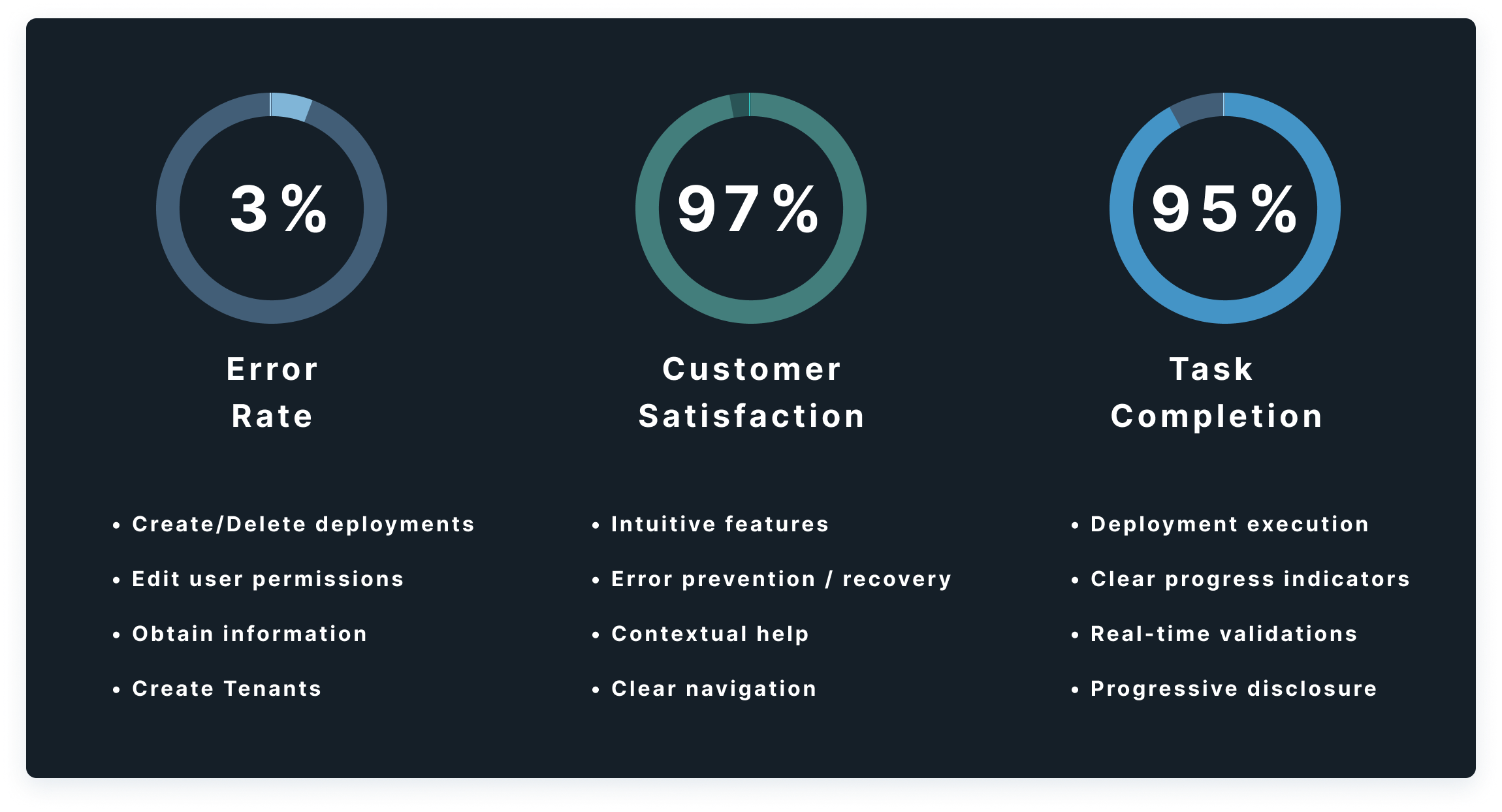
- Deployment editing screen after user testing. (Task completion time reduced by 15%)

User Management
Pioneer’s users needed a seamless way to edit individual users and their permissions. Since this was the MVP, the design was built for scalability, allowing for easy content creation and future feature expansion as needed, hence some extra white space for such future enhancement or additions (e.g, more deployment environments, or user permissions).


- Specific user editing screen, with breadcrumbs for easy navigation within the system
