Dealer Specialties (DS) provides custom vehicle merchandising services such as interior and exterior photography, interactive 360° reports, videography, detailed vehicle condition reports, and inventory management Saas apps among other dealership services.
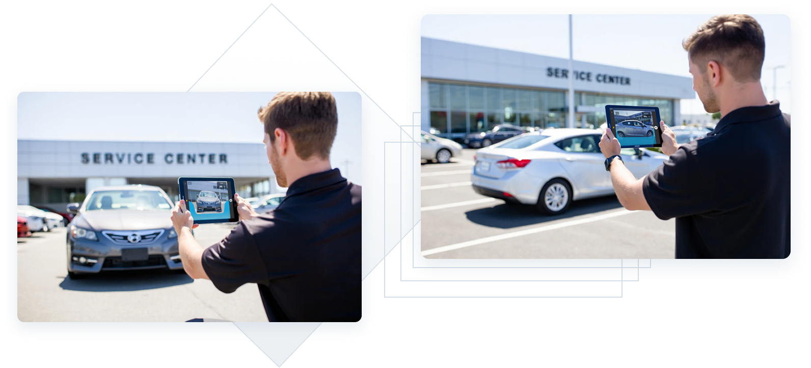
One of DS’ mobile products is called Rapidlot®. With it, field technicians/photographers perform multiple vehicle inventory management and inspection duties, one of the main ones being photography services for online dealership websites.
This functionality is also shared among other products designed for tablet and mobile phone views, and it this project focused on adding a guided photo experience to ensure consistency.
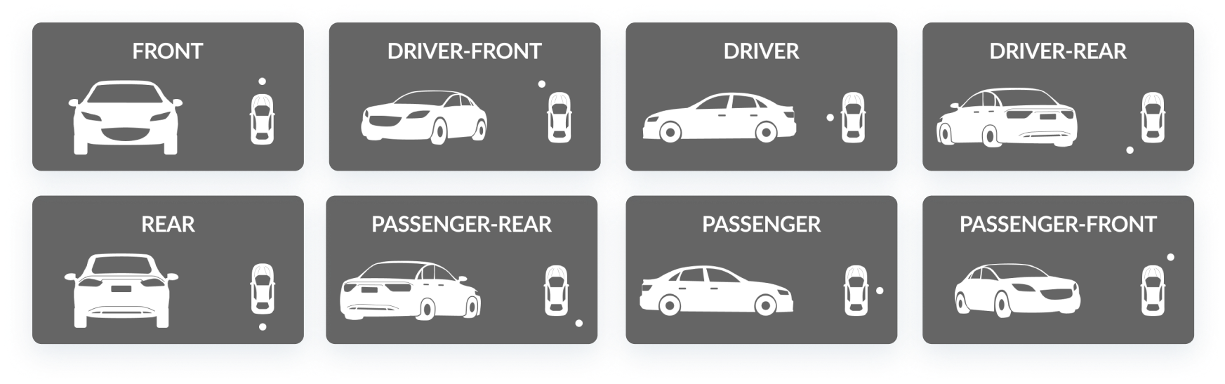
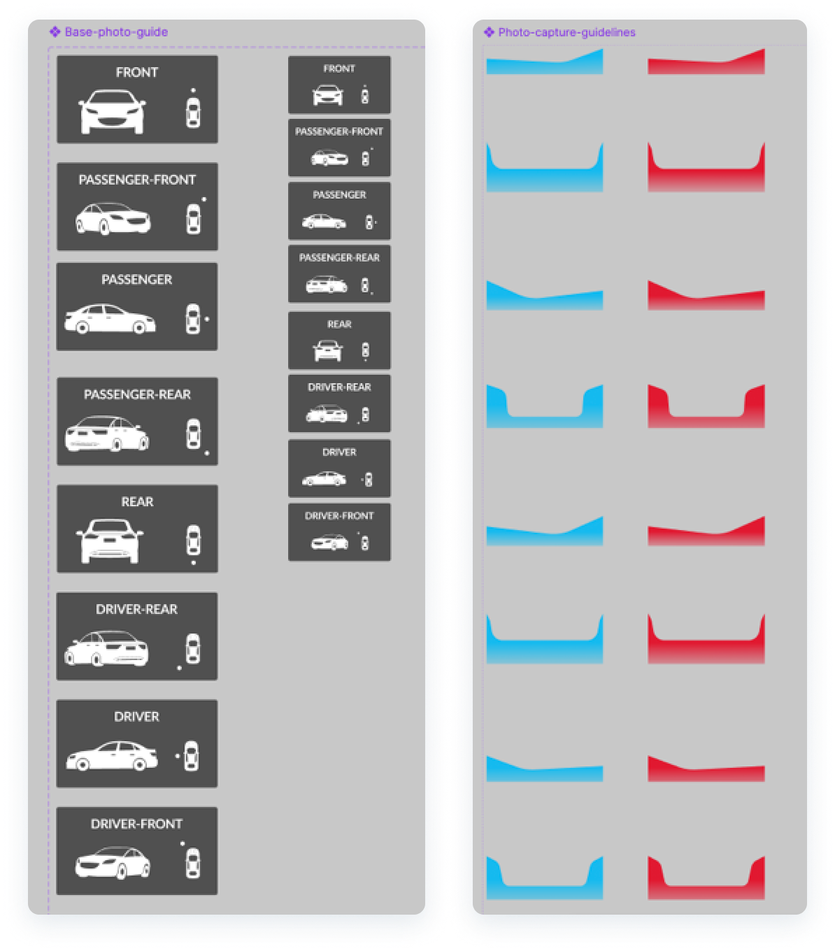
To design a guided photo experience for field technicians/photographers to capture the 8 main exterior angles of a vehicle, ensuring high-quality, consistent photos for online inventory pages and other merchandising products.
framework

Field technicians/photographers struggle to capture consistent, high-quality exterior vehicle photos. This inconsistency leads to dealership inventory pages featuring images of the same angle that vary in height, distance, and overall quality, undermining the professional appearance of the listings.
How might we simplify the photo-taking process to ensure consistent, high-quality images that enhance dealership websites, increase DS’ sales and Dealership customer acquisition, and instill confidence in potential buyers?
I created a FigJam board where I analyzed multiple competitors by watching their videos, learning about their process, their training materials, and much more.
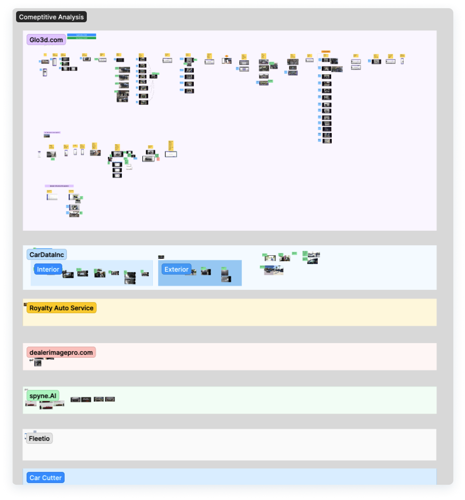
- Although these wireframe-like guides by Glo3d may work, they don’t align perfectly with the vehicle that is being photographed, which may cause confusion or wasted time trying to align different parts at once.
- This solution requires multiple image guides or wireframes depending on the vehicle trim or body style (Pickup trucks, SUV, Sedans, Coupe, etc.), adding time and effort to design and dev work.
- Spyne.AI (who later became our partner) has documentation explaining how photographers should line up the camera with the headlights for the best shot possible.
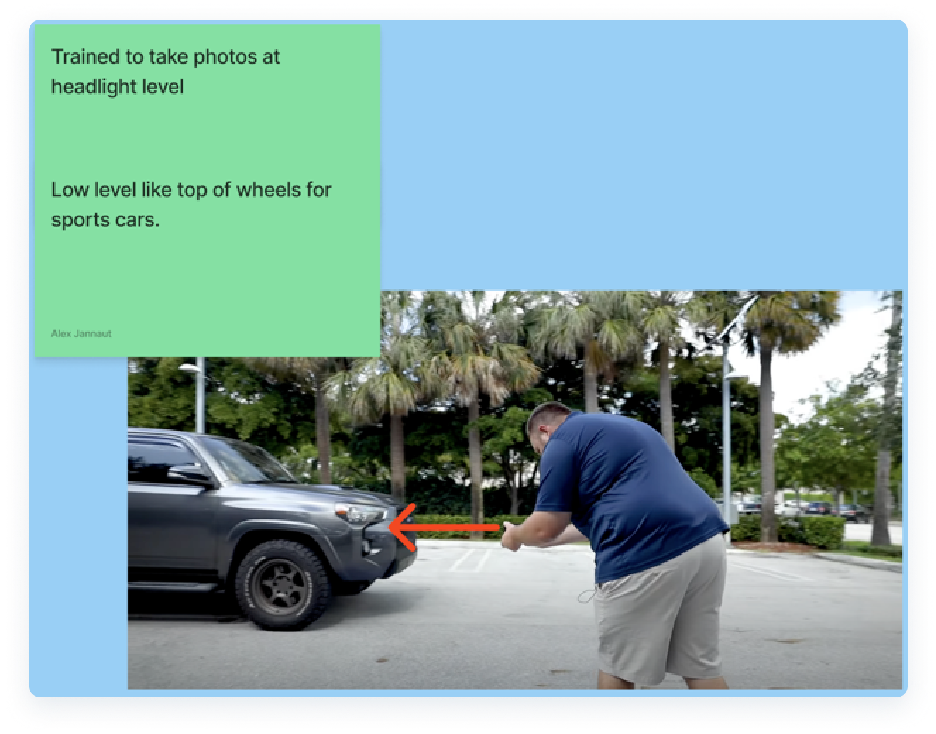
- Cardata.inc also trains their photographers to align their cameras with the headlights, something DS was not standarizing in their process.
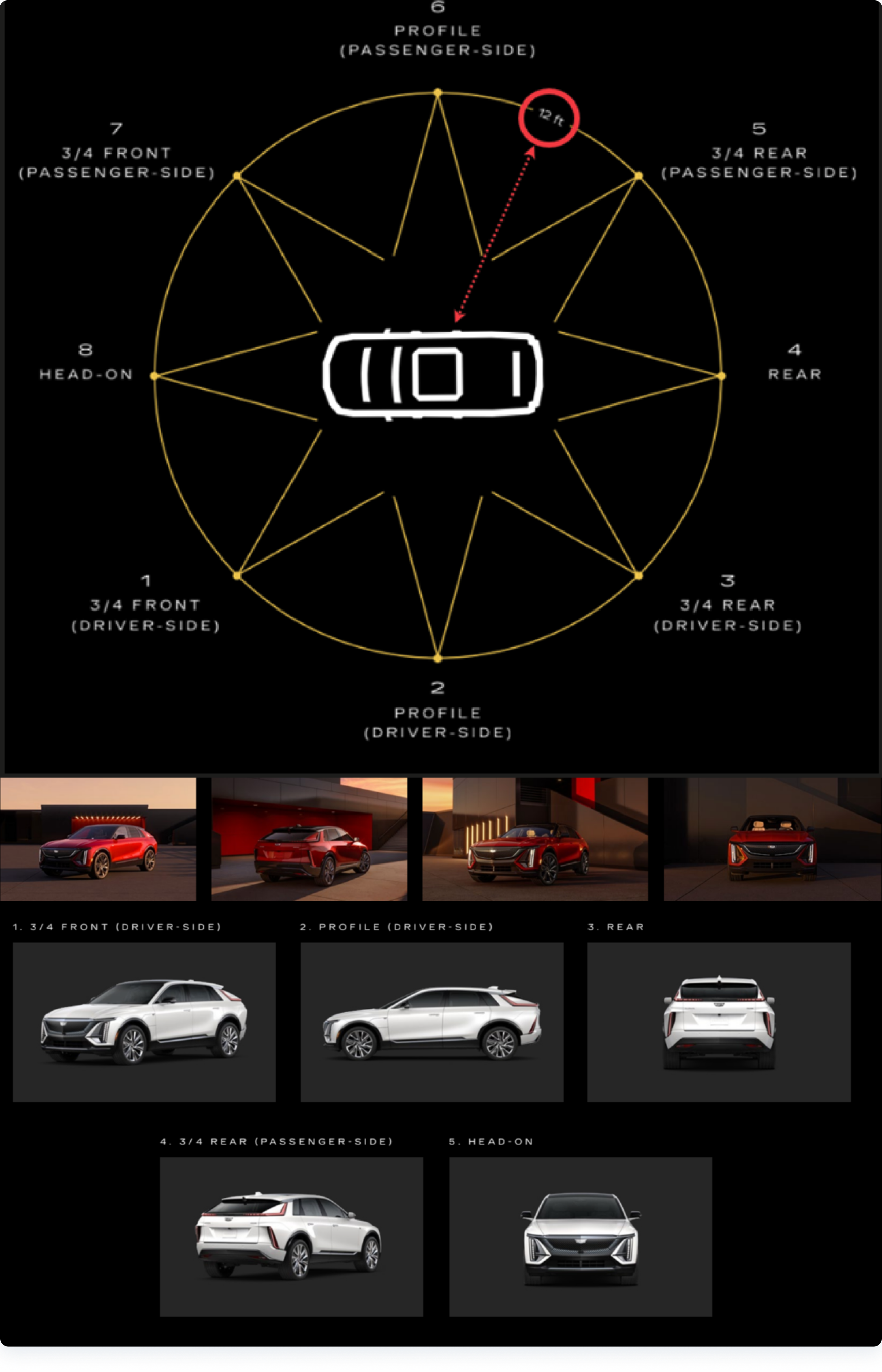
- I also analyzed different Original Equipment Manufacturer (OEM) materials from different car manufacturers. This example from Cadillac shows the optimal angles and distances to capture the best photos possible for their marketing and sales materials.
Our field technicians/photographers visit car dealerships all day; thus, their device screens are consistently exposed to sun glare and other environmental conditions. Because of this, I researched the best ways to use color for my UI photo guide designs that would work best in such conditions.
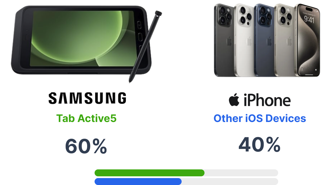
According to this article from Medium titled "Industrial UX: Sunlight Susceptible Screens", colors such as cyan, yellow, or green, work best for screens that are used while exposed to sun glare. These colors' high luminance works well on LCD an LED screens, especially for the Samsung tablets and other iOS phones that our users use the most. This project was mostly tested and optimized for Samsung’s Tab Active 5 Tablet screens because of its high usage in the field but both device types were equally considered.
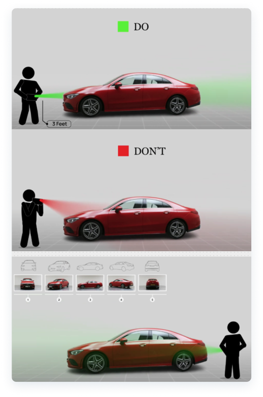
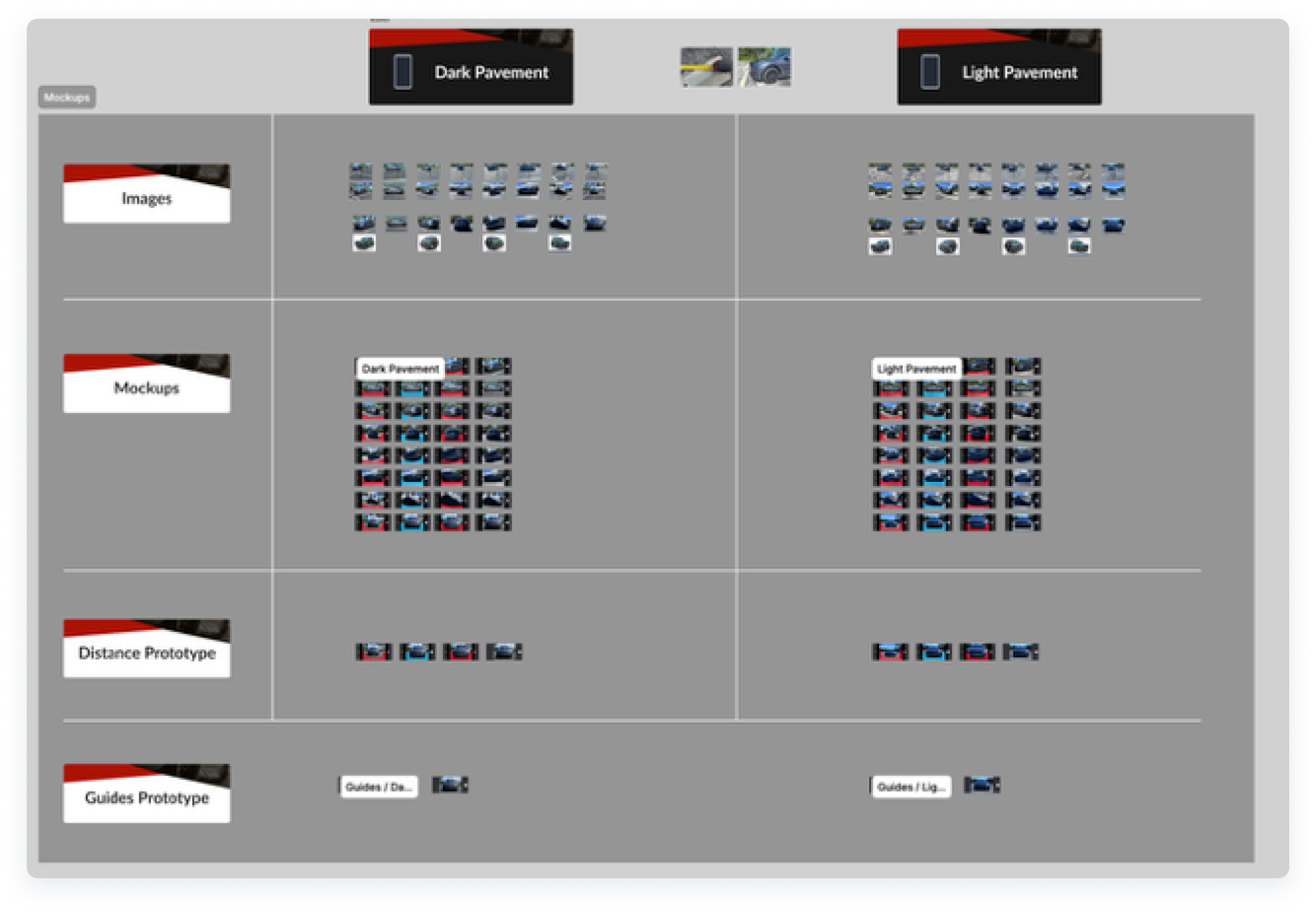
With the new knowledge from my research, I went out to two different parking lots. One with light pavement and another one with dark pavement.
I needed to capture photos on both, following the recommended camera height, distance, and angles so that I could feel what our users would when working at different car dealerships, and also be able to test my designs for accessibility and contrast.
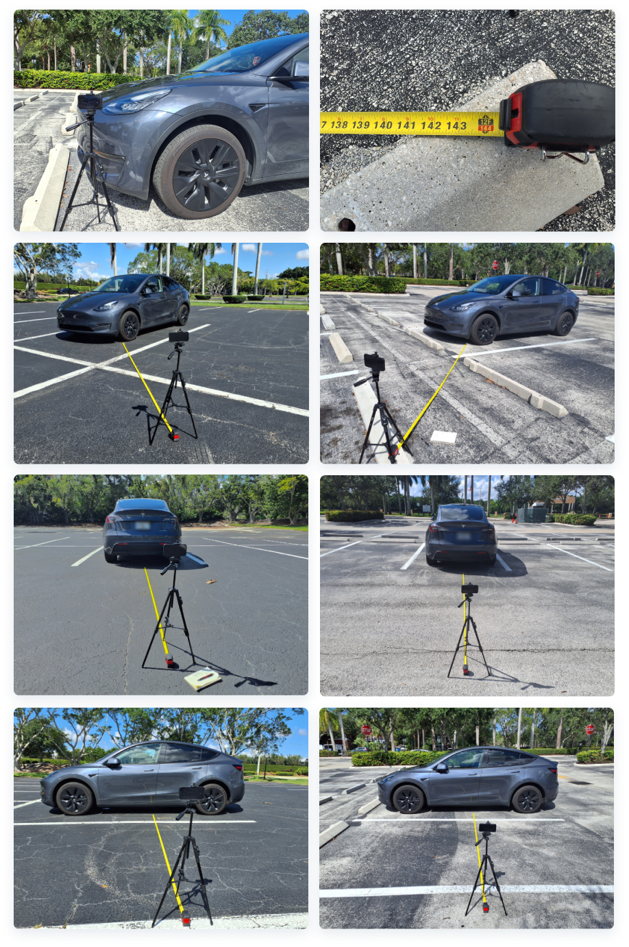
- A few examples of my photo-capturing process using my vehicle at different locations.
design
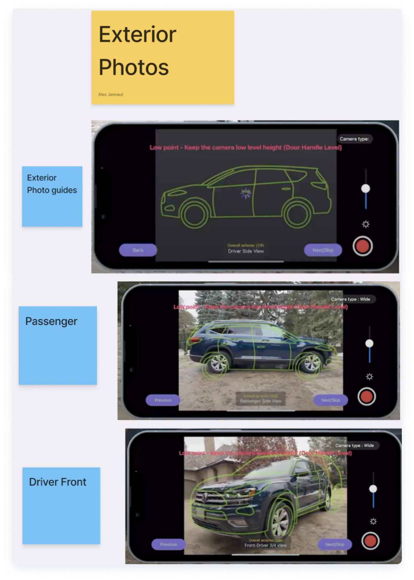
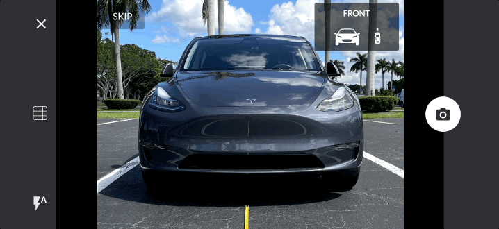
By following Cadillac’s “perfect image” examples from their OEM catalogues, I designed guides that would work for all the 8 main exterior angles that our Dealership customers need the most.
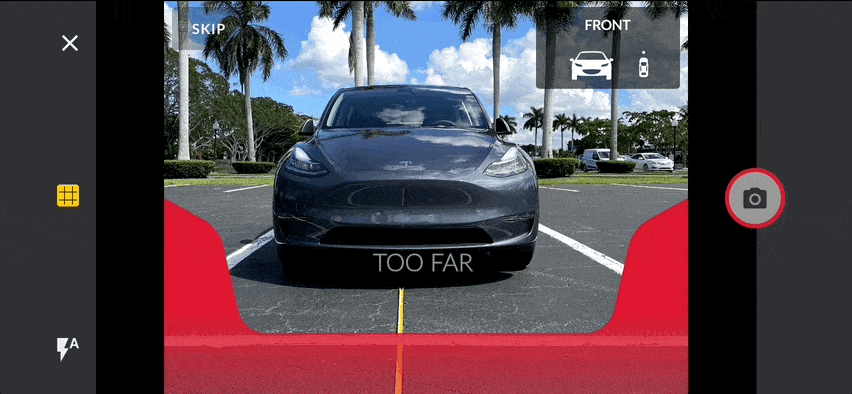
I created a minimal design that could work for any vehicle type and be simple to align, that would contrast well with any pavement background, contrast well while exposed to sun glare, and would reduce cognitive overload for our users.
- Not all dealerships prefer the same photo style; therefore, leaving a little bit of room to deviate was necessary. Sometimes the guides would not need to align perfectly depending on their needs. At times, they prefer to show more of the rear, or the doors, the front, etc.
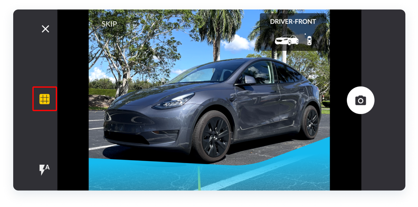
- Position indicators that I designed to guide the experience.
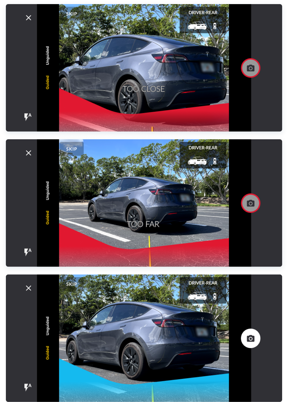
- We also validated the use of distance indicators and received positive feedback from the field. Although not part of our MVP, the distance indicator designs received 97% acceptance rates from our users and would be assigned to later post-MVP sprints.
Test
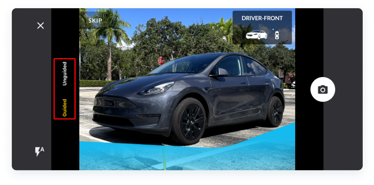
After demonstrating my Figma prototypes to a few users, we came to the conclusion that using the words “guided” and “unguided” could be a bit redundant and confusing. Instead, I redesigned the guide trigger to be a toggle affordance on their screen that would show/hide the guides with one tap.
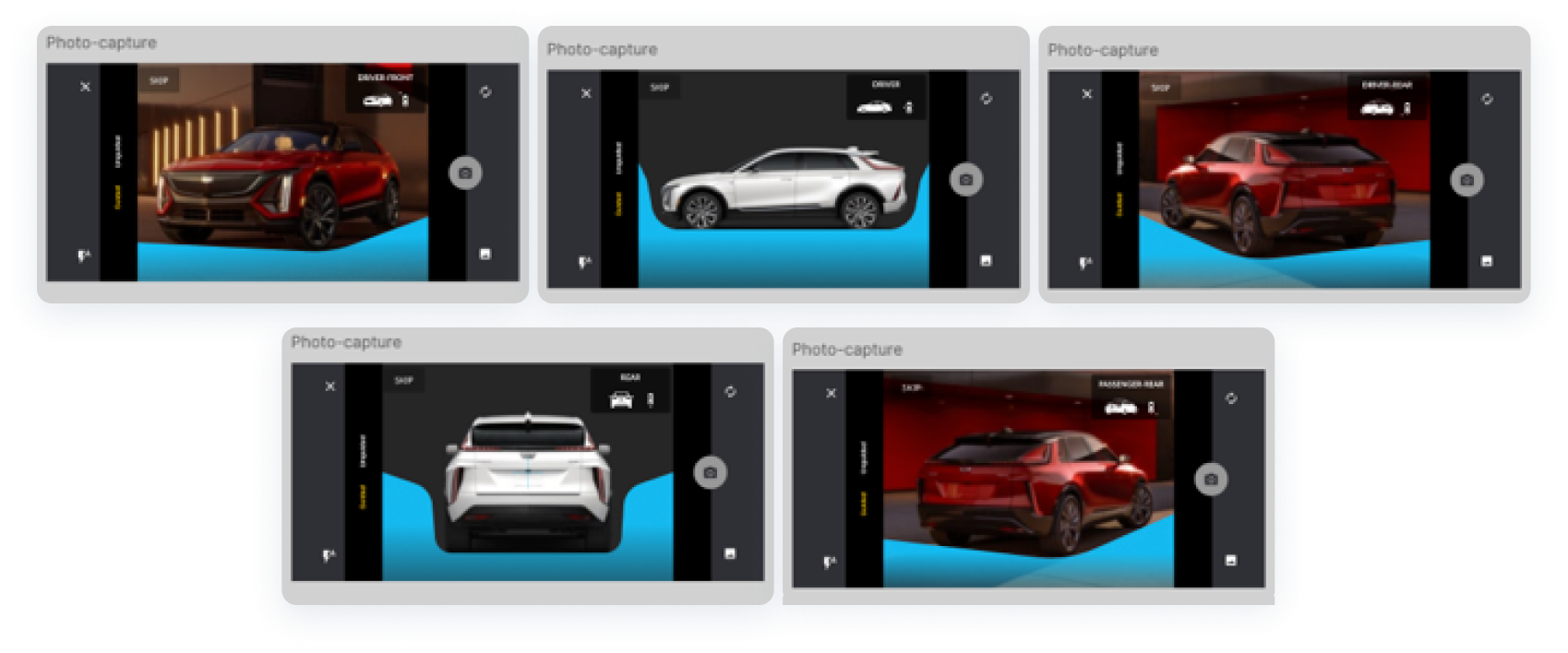
- AI - generated demo images, as photo documentation was not conducted that day.
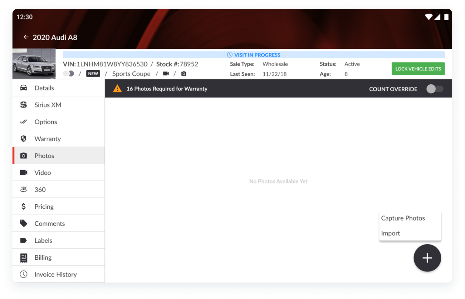
Although I designed parts of the RapidLot® app screens for a separate project that were not specifically part of this photo-guides project, here is an example of where this experience is accessed from within the tablet-specific screen:
handoff
Once the designs were tested and validated with our users, I handed off every Figma component and asset that our development team would need.
I also documented my process and provided examples from my dark and light pavement tests and photo capturing process.
Our users reported NPS scores of 90 with these guides. There are new users who come on board very often to work as field technicians / photographers and their feedback as a brand new user was also positive, stating that this helped them capture photos in a very easy way that made their jobs seem much simpler.
Product and stakeholders also reported that our dealership customers were now obtaining consistent images that looked optimal for their inventory sites.
Although this project is still being validated and tested as of the time of this writing, more data will continue to be gathered to be able to share more accurate results on this case study.