VinMotion is an enterprise web app that has multiple functions; all of them designed to assist vehicle dealerships with their extensive vehicle inventory management tasks.
As a full-time team member at Dominion Enterprises / Dealer Specialties, I contributed to several projects, including optimizing the UX/UI for the vehicle appraisals feature in one of our main web-based products, VinMotion.
The main goal was to redesign a feature called “Appraisals”, where dealerships can input data regarding a vehicle’s condition and find out if they can recondition it and sell it for a profit.
This project required restructuring multiple sections, streamlining steps, and introducing new features to enhance both UX and UI. It highlights key design improvements implemented prior to launch.
framework
It was imperative for me to know the reason behind the redesign request, as well as what determined if the product redesign was a success; some of the main issues with the previous design included:
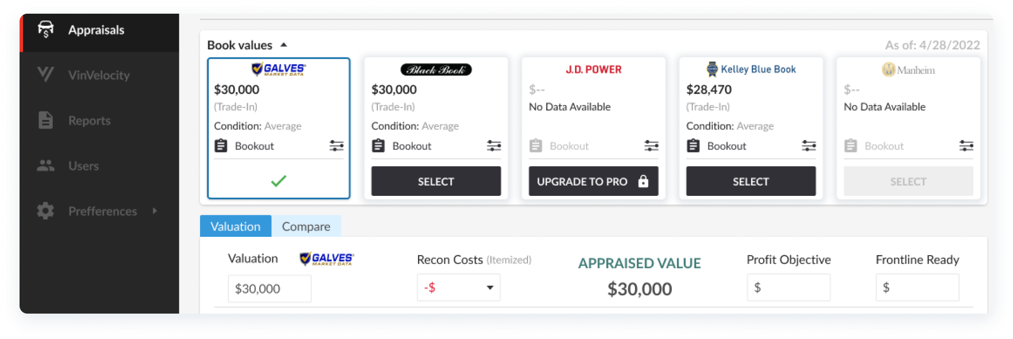
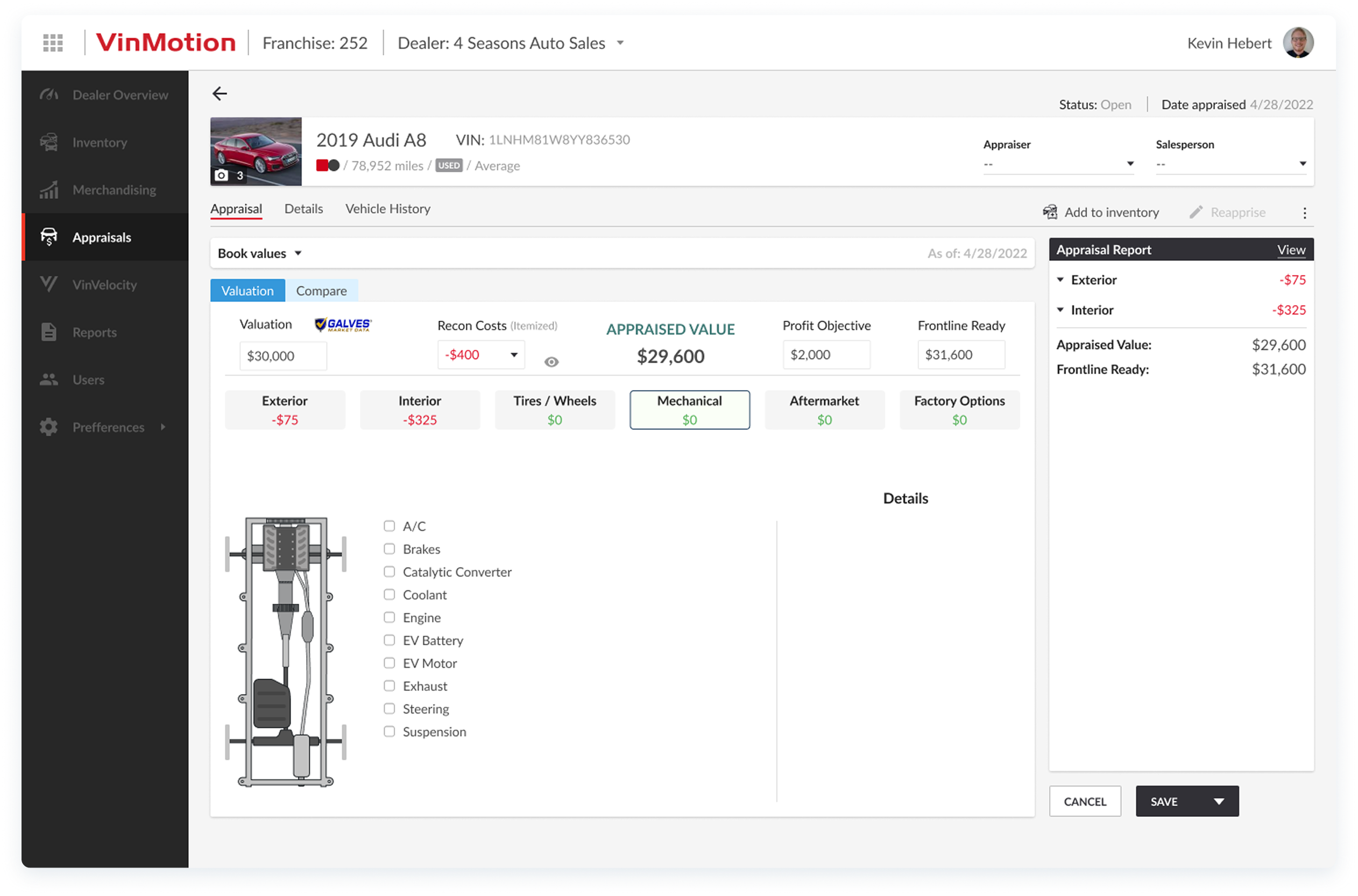
- Users not being able to easily find Book Value information which determines the base price of each vehicle, serving as a crucial first step in the vehicle appraisal process.
- The final price calculator was not easily editable and lacked certain sections that help determine final price easily.
- Cognitive overload occurred often since all the information was presented in one page, including features that belonged in their own separate sections.
- Certain elements needed to be added without disrupting the feature’s natural flow.
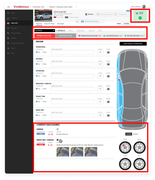
- The previous design idea contained elements that did not pass accessibility tests, occupied too much real estate and forced users to scroll below the fold unnecessarily, and also contained elements that were no longer needed for this particular experience.
- The previous design also included multi-select pills for selecting vehicle damages. I optimized this with checkboxes that were ordered alphabetically to help users find the damage point they needed easily and quickly as this was an experience that would be new to them.
This Medium article titled "Improving the usability of multi-selecting from a long list" emphasizes the importance of each element, highlighting their respective strengths or weaknesses depending on the desired experience.
"The multi-select pill box is a good solution when the user is familiar with the content of the list and they know what they’re looking for. They can easily find by searching or just scrolling to the relevant part of the list. [...] When the content of the list is not familiar there are multiple issues".
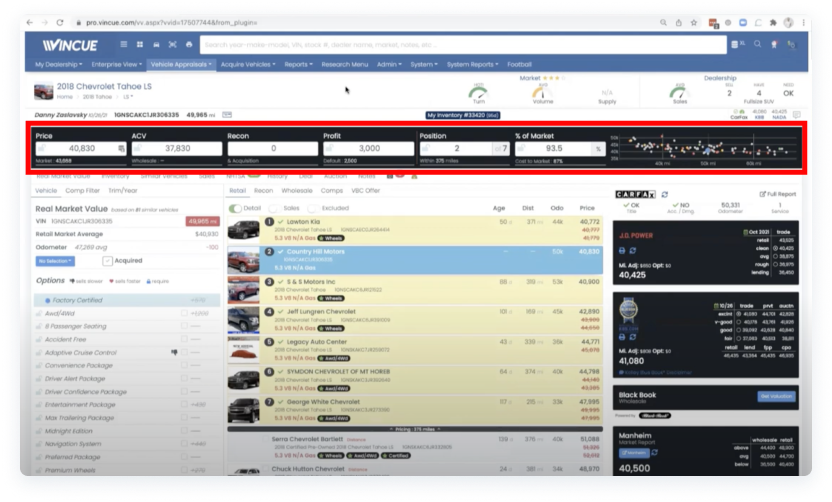
- I analyzed a few competitors or similar apps and sites to gather inspiration for potential improvement opportunities; in the example above, the main take away was how this competitor laid out their calculator. It is follows an easy-to-read horizontal flow with each section occupying its own input field.
define
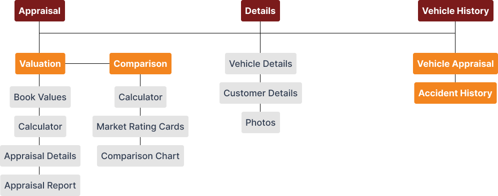
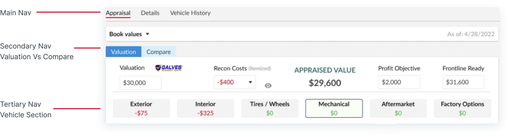
The strategy involved allowing our end users to find the right information and be able to input it quickly and easily. This meant breaking up the appraisals feature into 3 main sections, or tabs: Appraisal, Details, and Vehicle History.
Design
After defining the project’s main idea, I sketched potential solutions on a whiteboard and a notepad for accessing book values, vehicle sections, and other information.
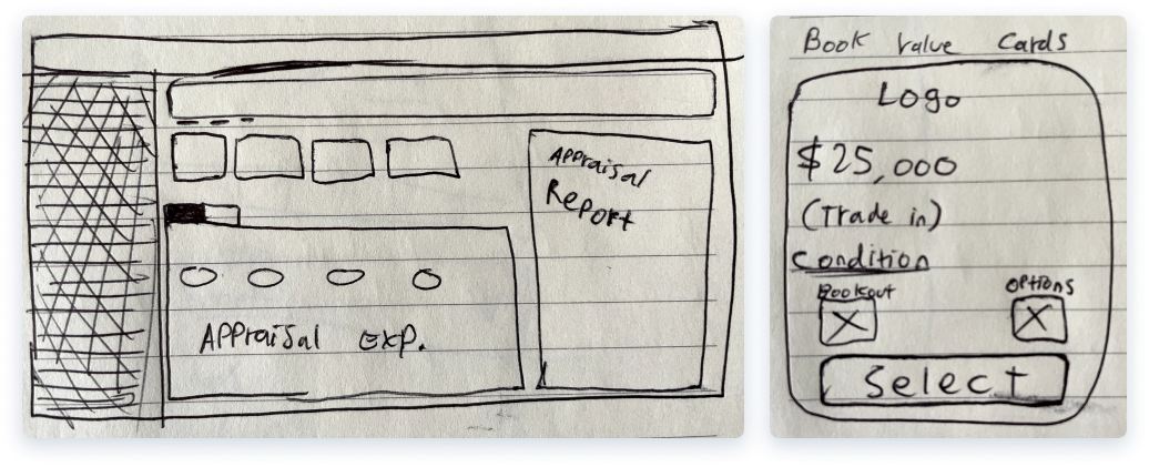
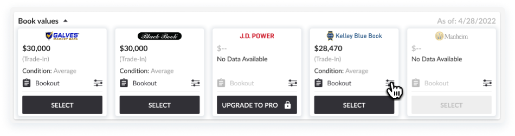
- These book value cards were placed on the top-left of the “Valuation” page; allowing fast and easy visibility, specifically because this is a crucial first step in appraising a vehicle.
- According to nngroup.com’s 10 Usability Heuristics for User Interface Design, The first heuristic (Visibility of System Status) states that “When users know the current system status, they learn the outcome of their prior interactions and determine next steps. Predictable interactions create trust in the product as well as the brand”
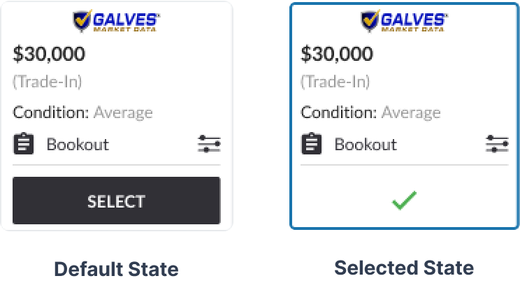
- Because of this, I started the interaction with “Book Values” as a first step, and also showed different component statuses to provide user feedback and help them view/remember their book value selection.
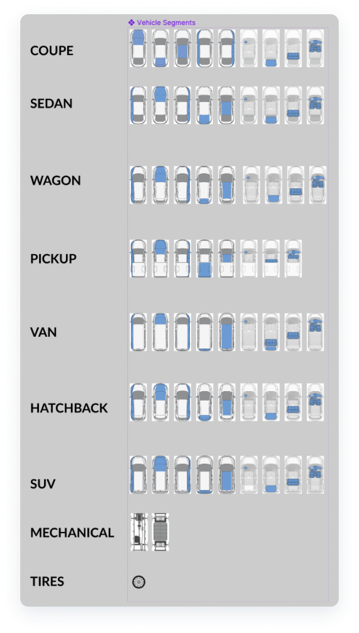
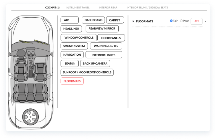
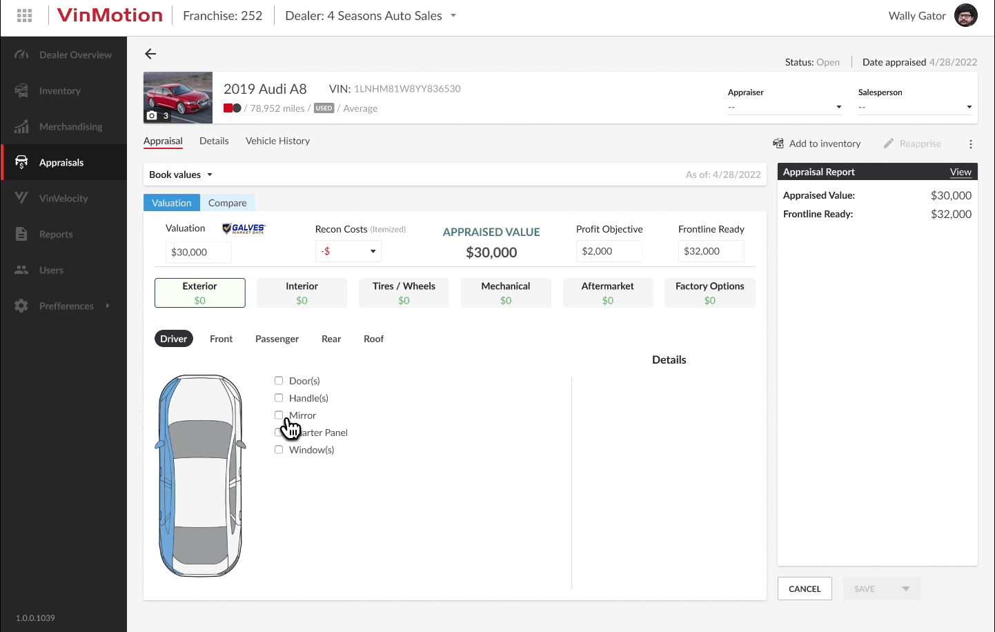
- Each vehicle body type and tires/wheels required its own vector image with different selectable sections (front, roof, interior cockpit, side panels, etc). I created these with a combination of Adobe Photoshop, and Figma components.
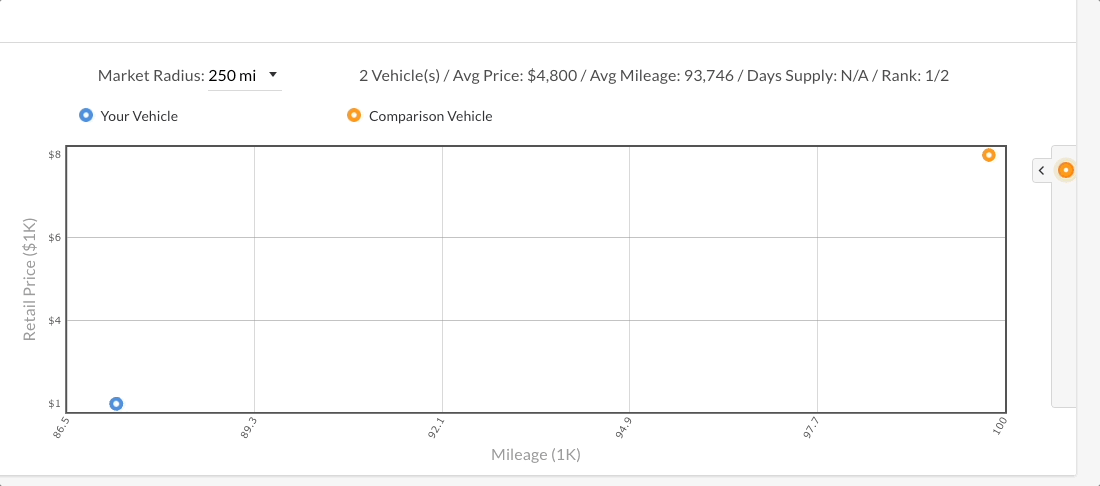
- Another UX improvement included the "Comparison" page and the way in which vehicles were viewed.
The previous experience seen above included a hidden section that was only visible when clicking on a specific vehicle in the chart. This element's z index was set to a high value that covered parts of the chart including vehicle comparisons, creating friction and forcing users to open or close it multiple times to be able to compare vehicles.
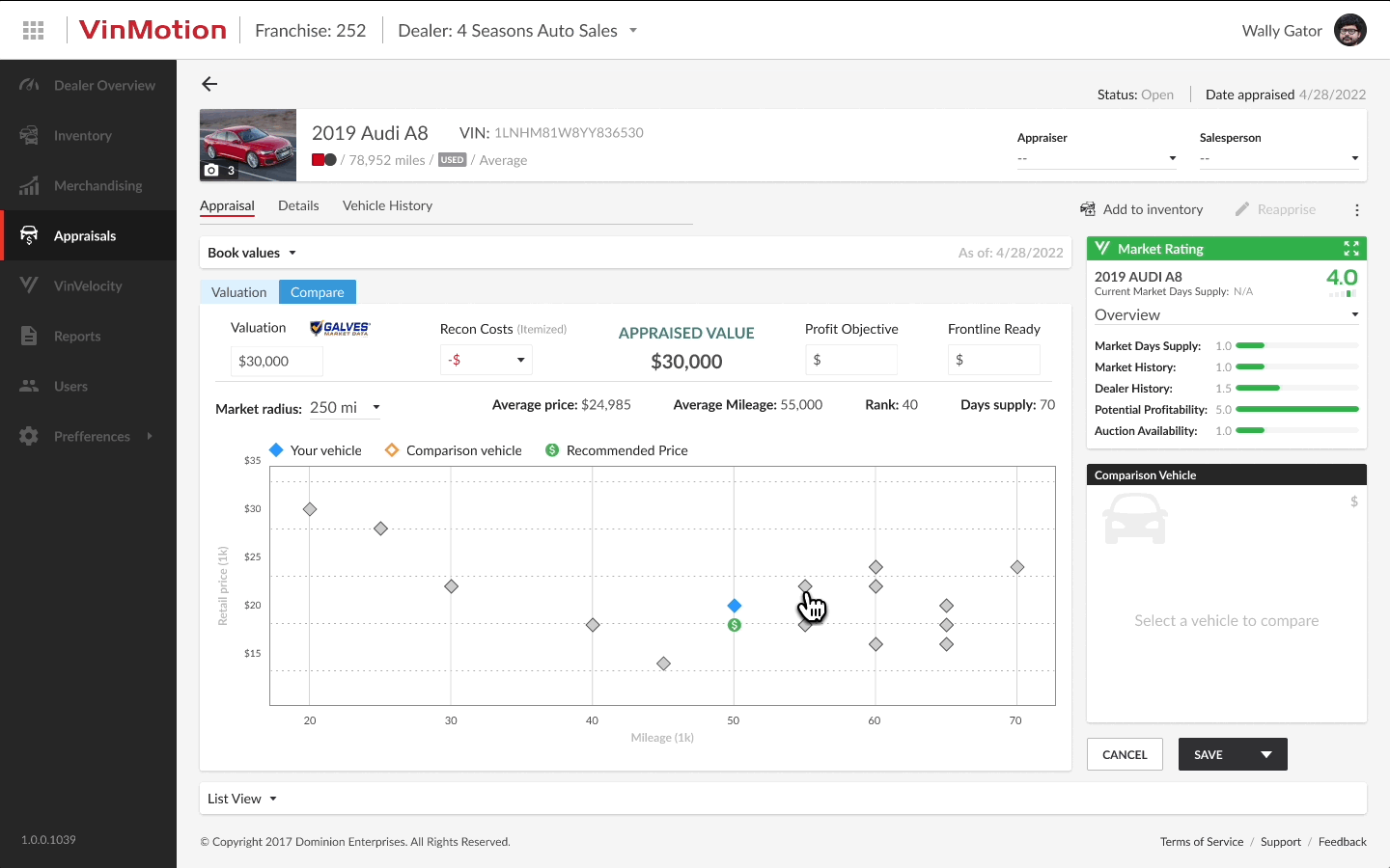
- In this new and optimized experience, the comparison section had its own real estate where it would not interfere with other elements or cover other items on the screen. This allows for easy access and better visibility.
- Prototype of the appraisals experience in action

- Optimized "Details" page
iterate
User testing enabled a more refined calculator experience by optimizing the placement of each element in the ideal order and identifying additional elements that could enhance the overall experience.
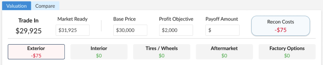
- Previous calculator prior to user testing.
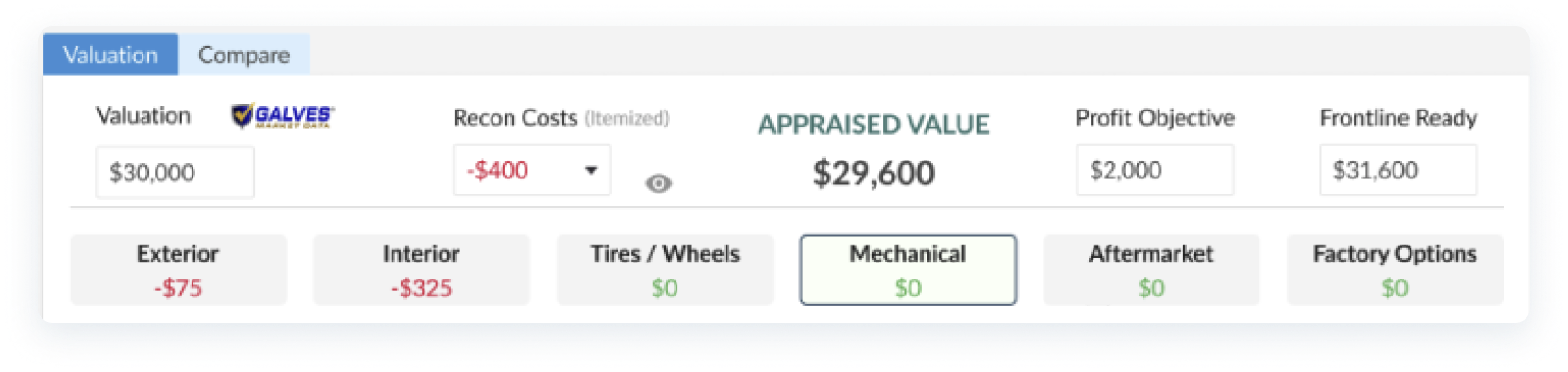
- Refined calculator after user testing.
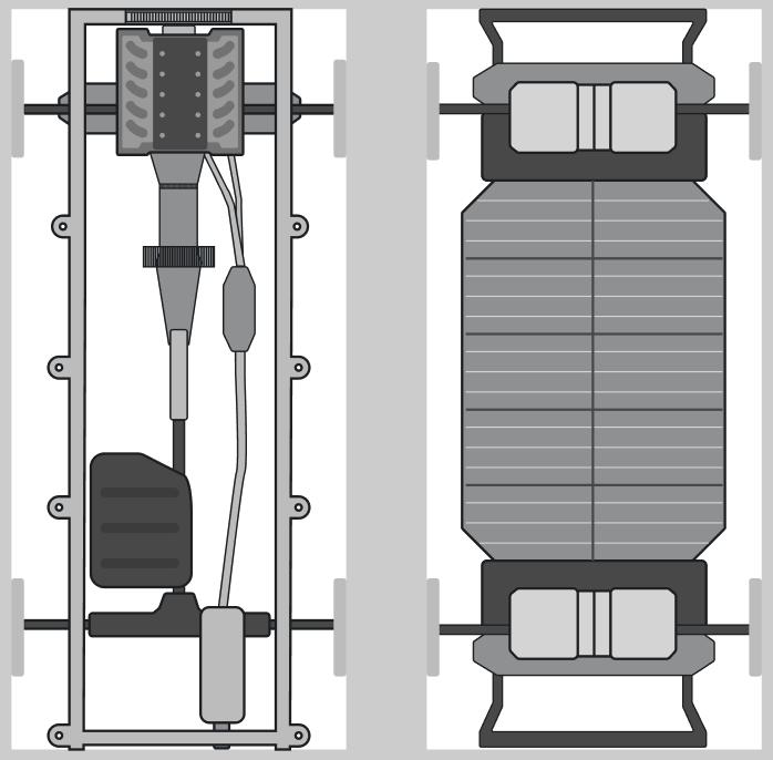
- For the "Mechanical" section, I needed to design and add both EV (Electric Vehicle) and ICE (Internal Combustion Engine) vehicle frames.
Finally, this experience was launched as part of the next VinMotion release. The entire design process spanned three sprints, encompassing research, design, testing, and iterations.
