summary
Dealer Specialties (DS) provides custom vehicle merchandising services such as interior and exterior photography, interactive 360° reports, videography, detailed vehicle condition reports, and inventory management Saas apps among other dealership services.
Dealer Specialties depended on Verizon Connect for scheduling vehicle inspections, for condition reports but market managers, support employees, and lot technicians (our primary users) reported significant friction, poor usability, and rising costs. Leadership recognized the need for a purpose-built solution to streamline job assignment, improve market oversight, reduce expenses, and integrate seamlessly with the mobile C.A.R.Score app already in use. This initiative led to the creation of DS Dispatch, a tailored platform designed to accelerate workflows, cut support volume, and deliver measurable operational savings.
mission
Create a unified job scheduling platform where managers can find jobs, assign lot techs, and manage markets in a faster, simpler, and more accessible way, while integrating with the mobile C.A.R.Score app techs already use.
results
research
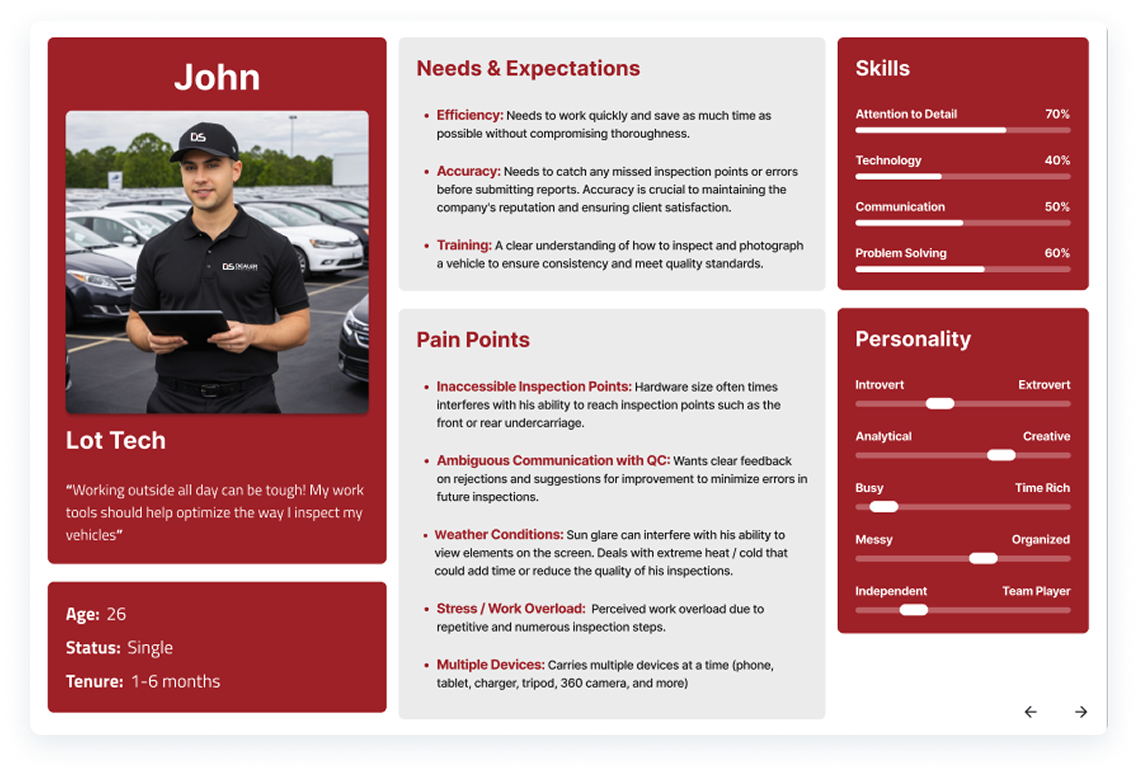
User interviews
I, alongside product management, interviewed field/market managers and lot techs in different markets across the US to identify pain points, usability issues, and gaps in Verizon Connect. We noticed that:
- Finding and assigning jobs was unintuitive.
- Managing markets was inconsistent.
- Support requests were high.
Design
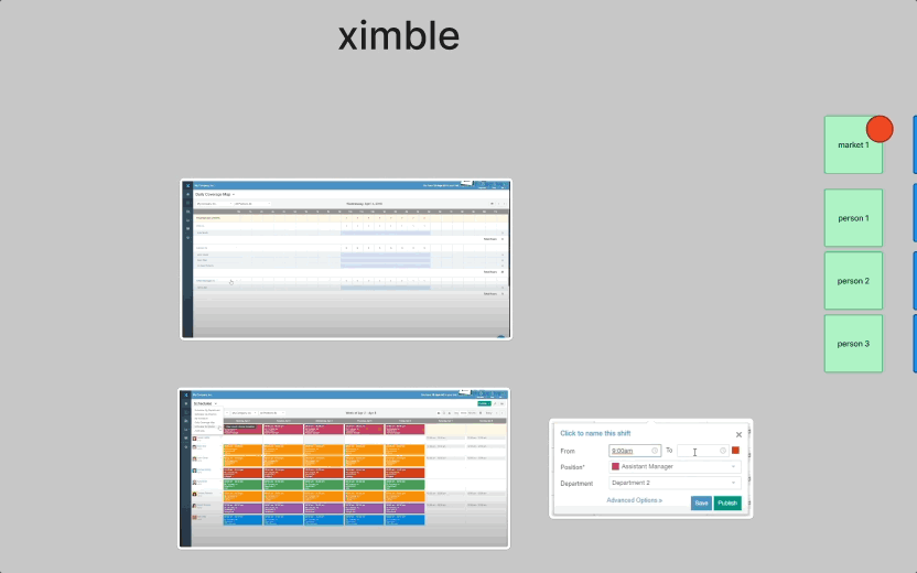
Competitive Analysis
I conducted a competitive analysis of relevant software solutions, drawing inspiration from HR platforms designed to manage job scheduling, user organization, and other core capabilities aligned with the functional requirements of our upcoming web application.
wireframes
I began by synthesizing insights from my research, combining recurring UI patterns and essential features into an initial concept. Key components included a calendar-based scheduling interface where users could seamlessly drag and drop lot technicians, assign precise dates and times, and annotate each job with contextual notes to enhance clarity and operational efficiency.
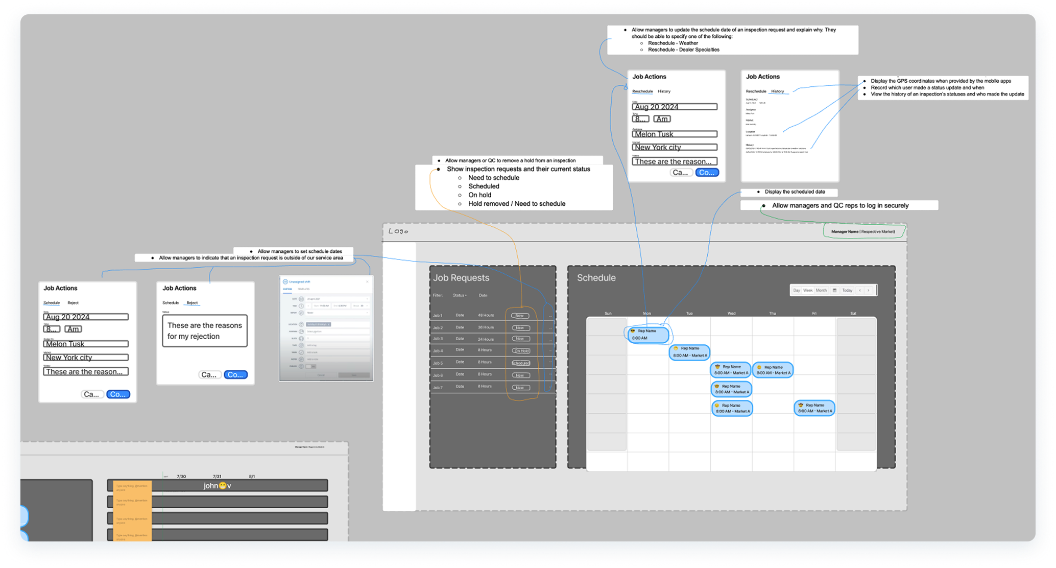
- Proof of concept wireframes using Figma and FigJam.
LOW-FIDELITY tests
I proceeded to design low-fidelity mockups to validate the concept, building on insights from earlier research and wire-framing sessions.
Given that both business stakeholders and end users emphasized simplicity as a top priority to optimize time and budget, the interface was intentionally streamlined with just two core tabs: “Jobs” and “Schedule”.
At this stage, the product had not yet been formally named, so we referred to it internally as the “scheduling app” as a placeholder.

- First iteration to test this idea and refine further.
test
design validation
After presenting the initial low-fidelity concept to a group of ten users combining both field/market managers and support/QC personnel, several critical insights emerged. We discovered that jobs carry a 48-hour service window, after which penalties and fees could be incurred if tasks remained unserviced. This introduced a clear need to refine the design to:
- Highlight job urgency to indicate when service is required within the maturity window.
- Draw attention to unscheduled or unassigned jobs that need immediate action.
- Display the original receipt timestamp from the corresponding auction partner.
- Visually emphasize which technician or team member each job has been assigned to.

- First iteration of visual indicators to emphasize urgency.
further refinements
Once again, it was critical to validate these new design directions and confirm alignment with user expectations.
Through additional validation sessions and collaborative design workshops, I refined the interface and re-imagined a significantly different approach that still preserved the product’s original vision while enhancing usability.
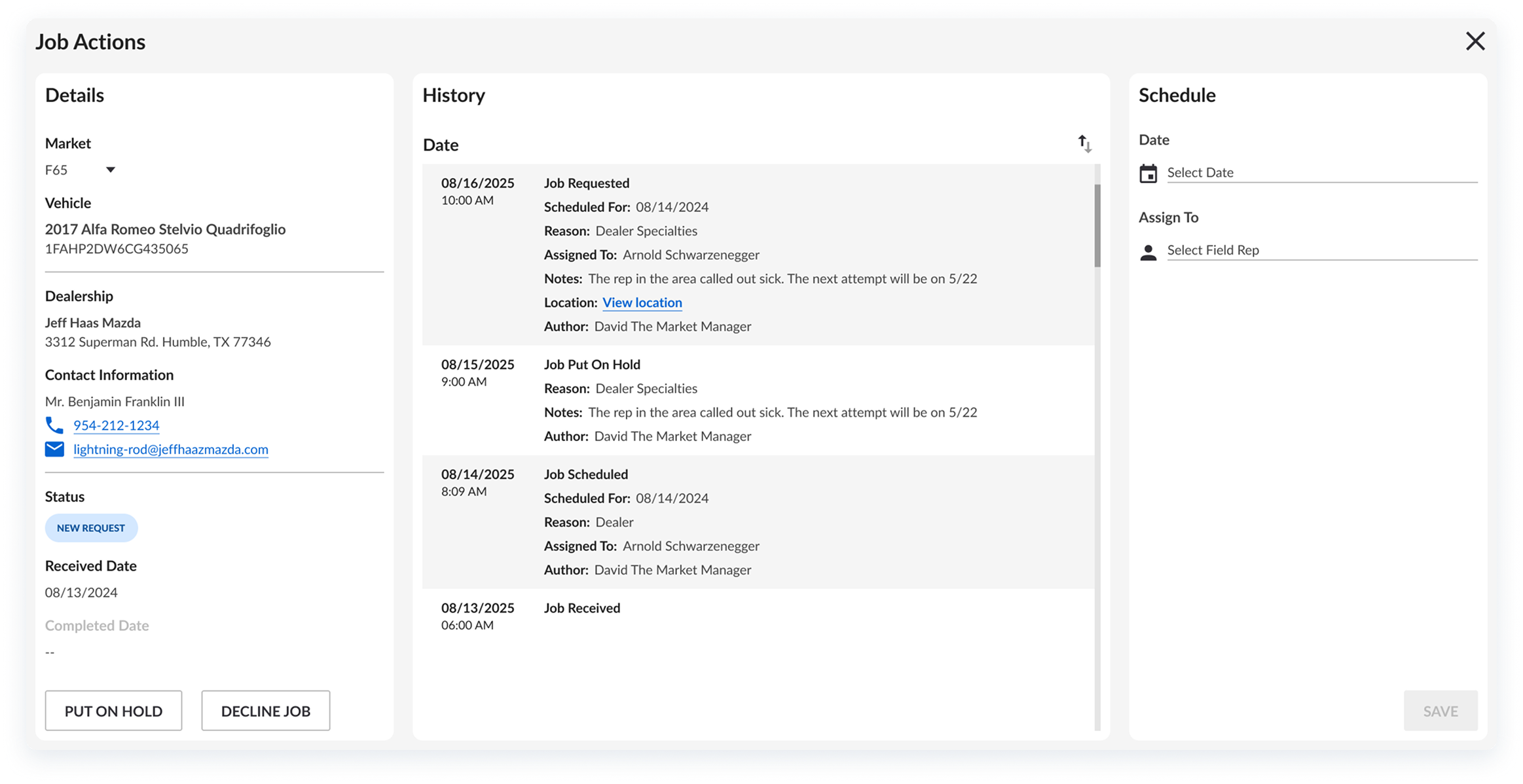
This iteration introduced a table-based layout supported by contextual modals, with each modal tied directly to its respective job. These modals presented all job details in a deliberate, structured sequence, reinforcing information architecture and hierarchy, and ensuring that critical data surfaced at the right time in the user’s workflow.

- It was at this time that Product Management and I got together and renamed this app “DS Dispatch”.
prototypes
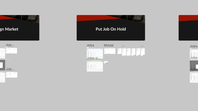
I then built interactive prototypes in Figma and facilitated moderated testing sessions with managers and admins. By observing real users, we captured actionable feedback and iterated rapidly to refine navigation, job assignment flows, and market management tools.
iterate
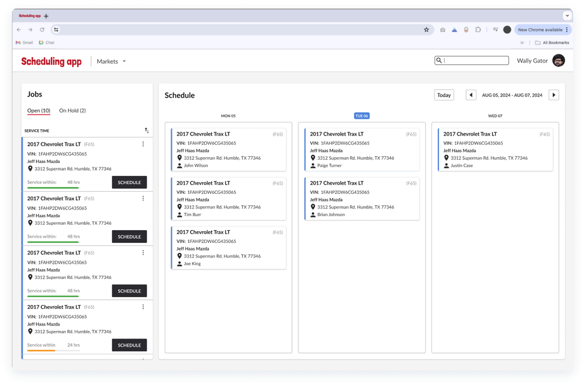
high-fidelity iterations
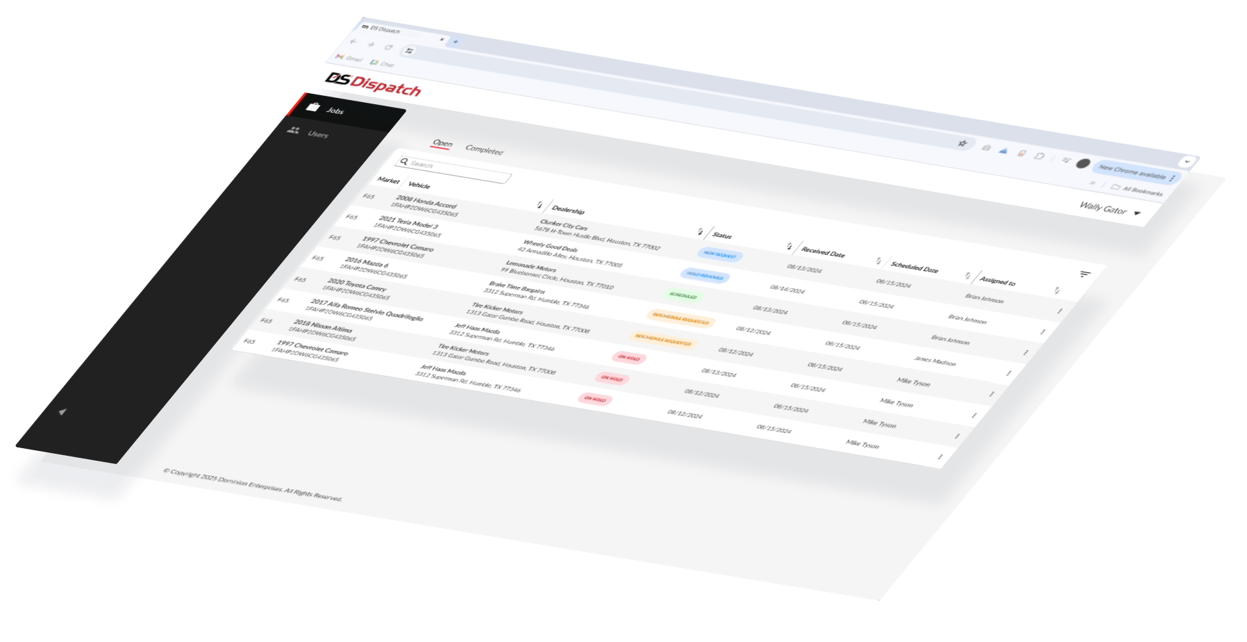
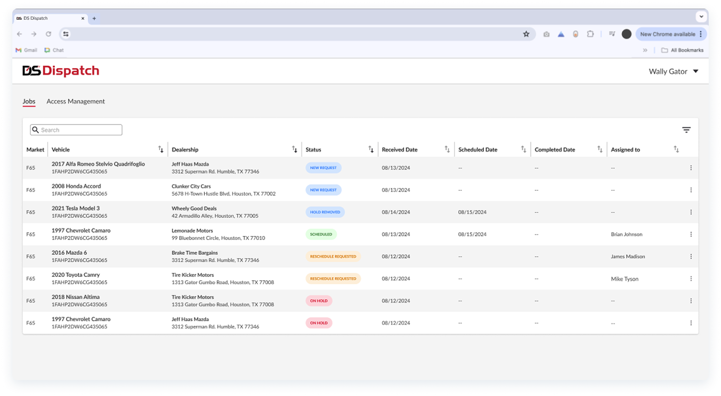
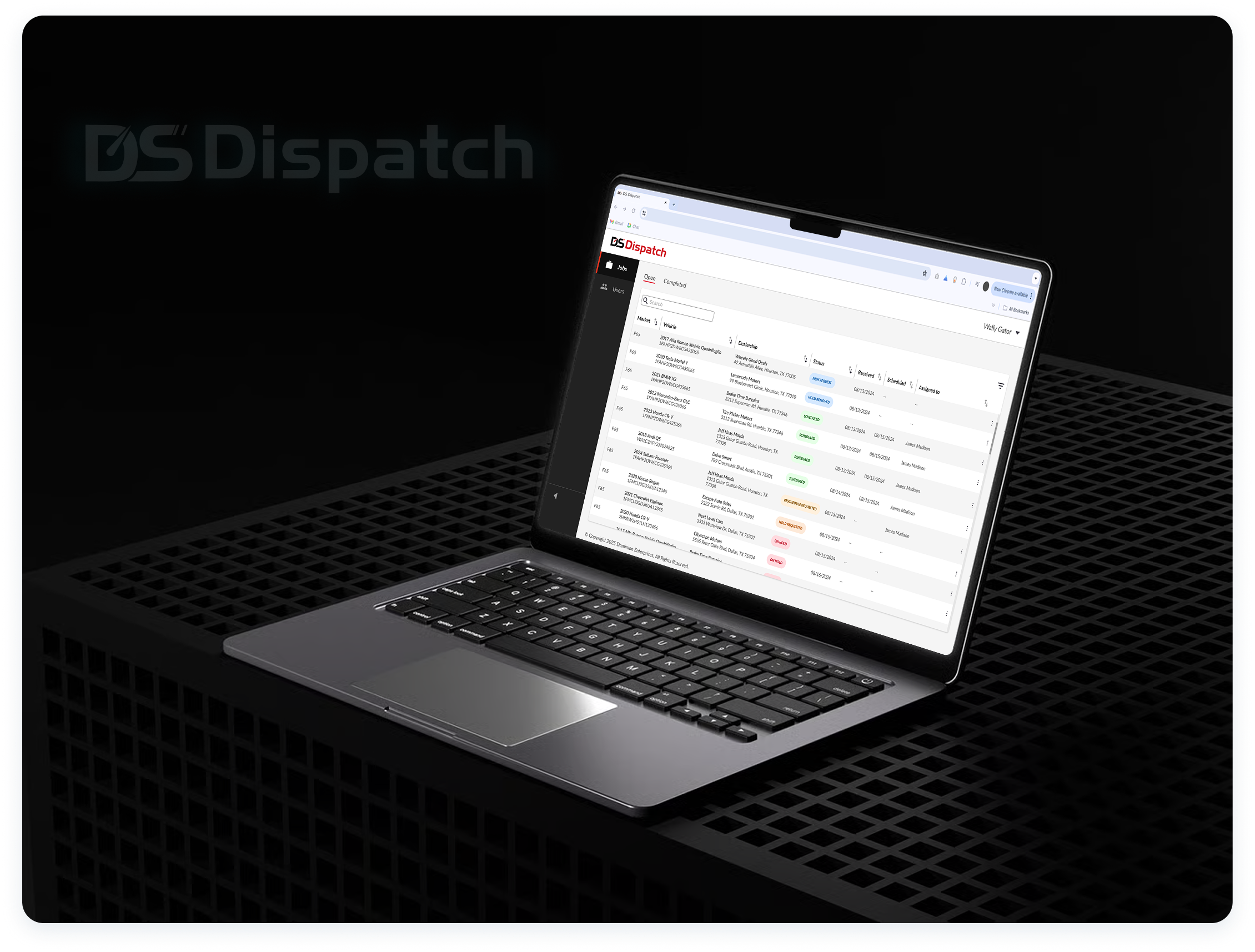
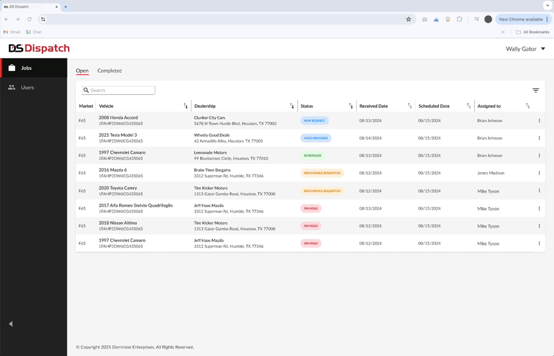
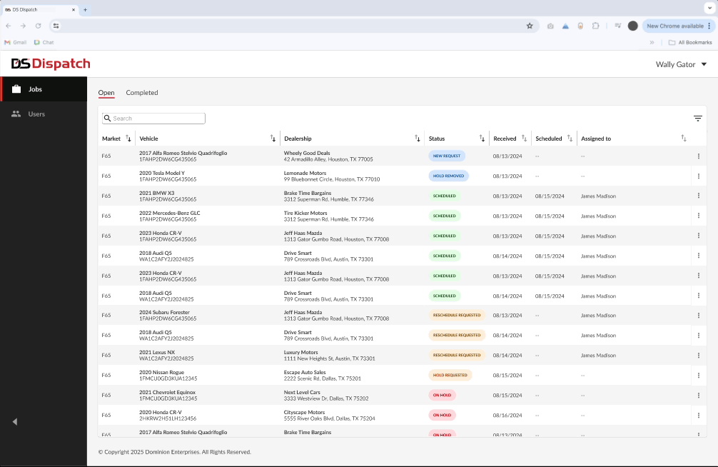
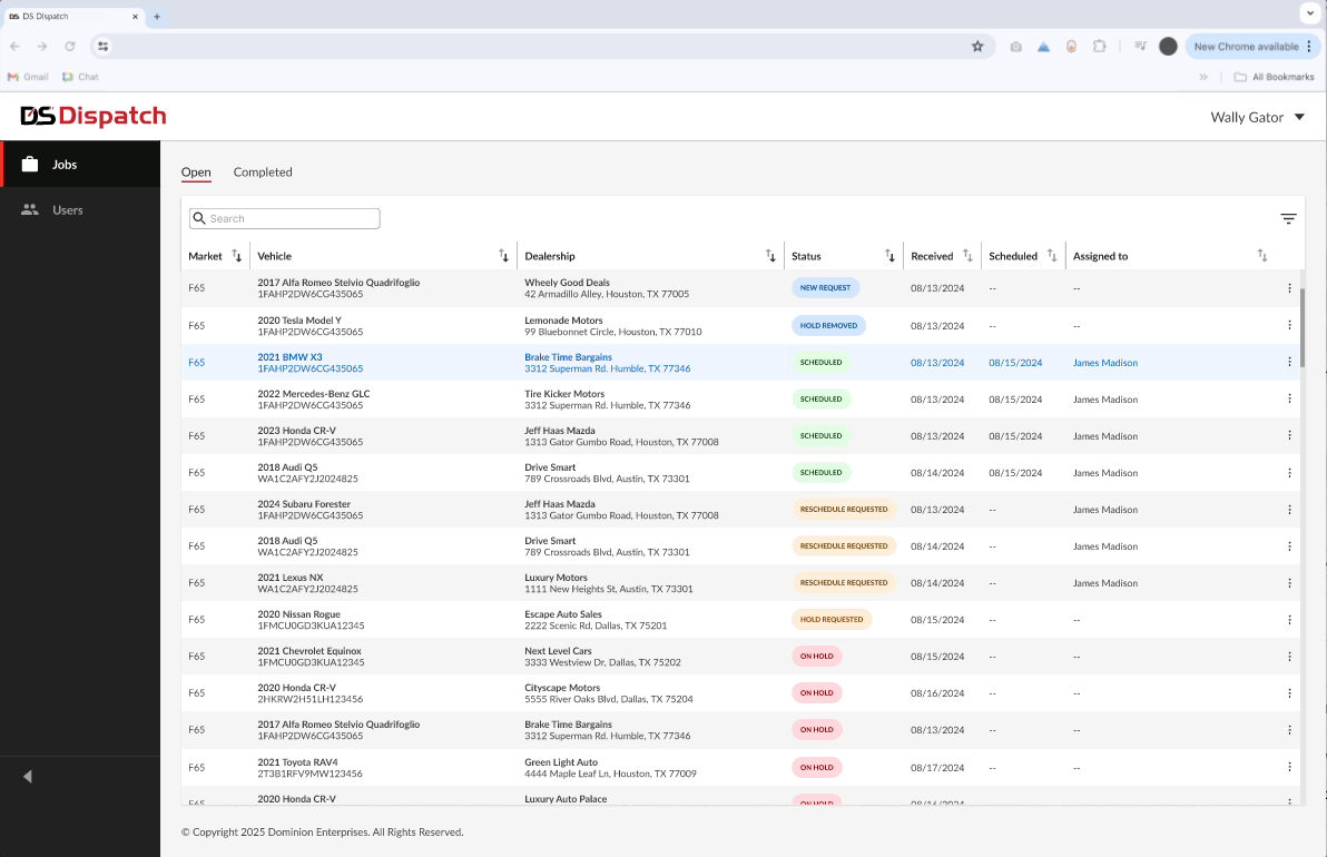
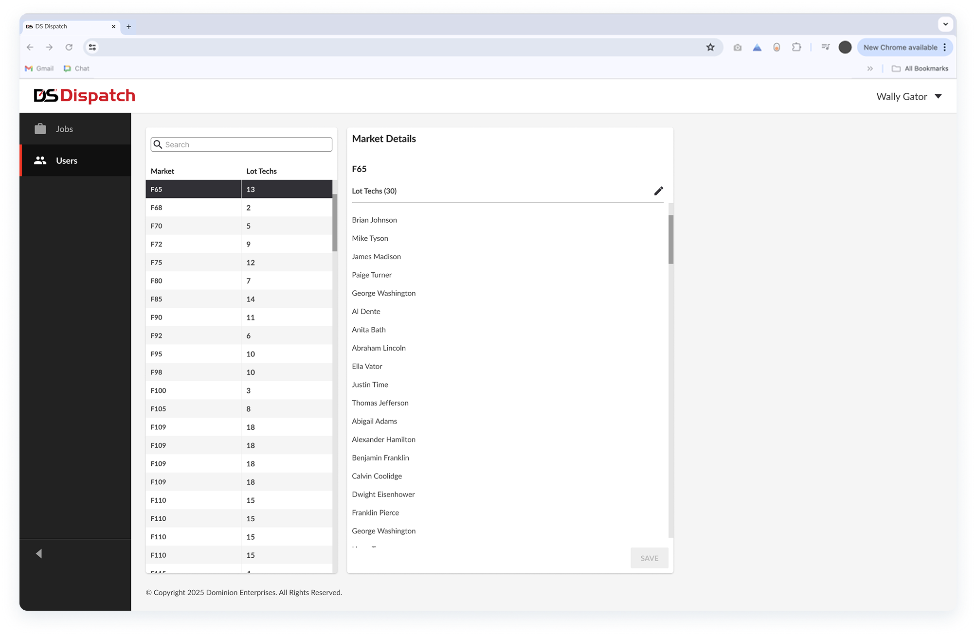
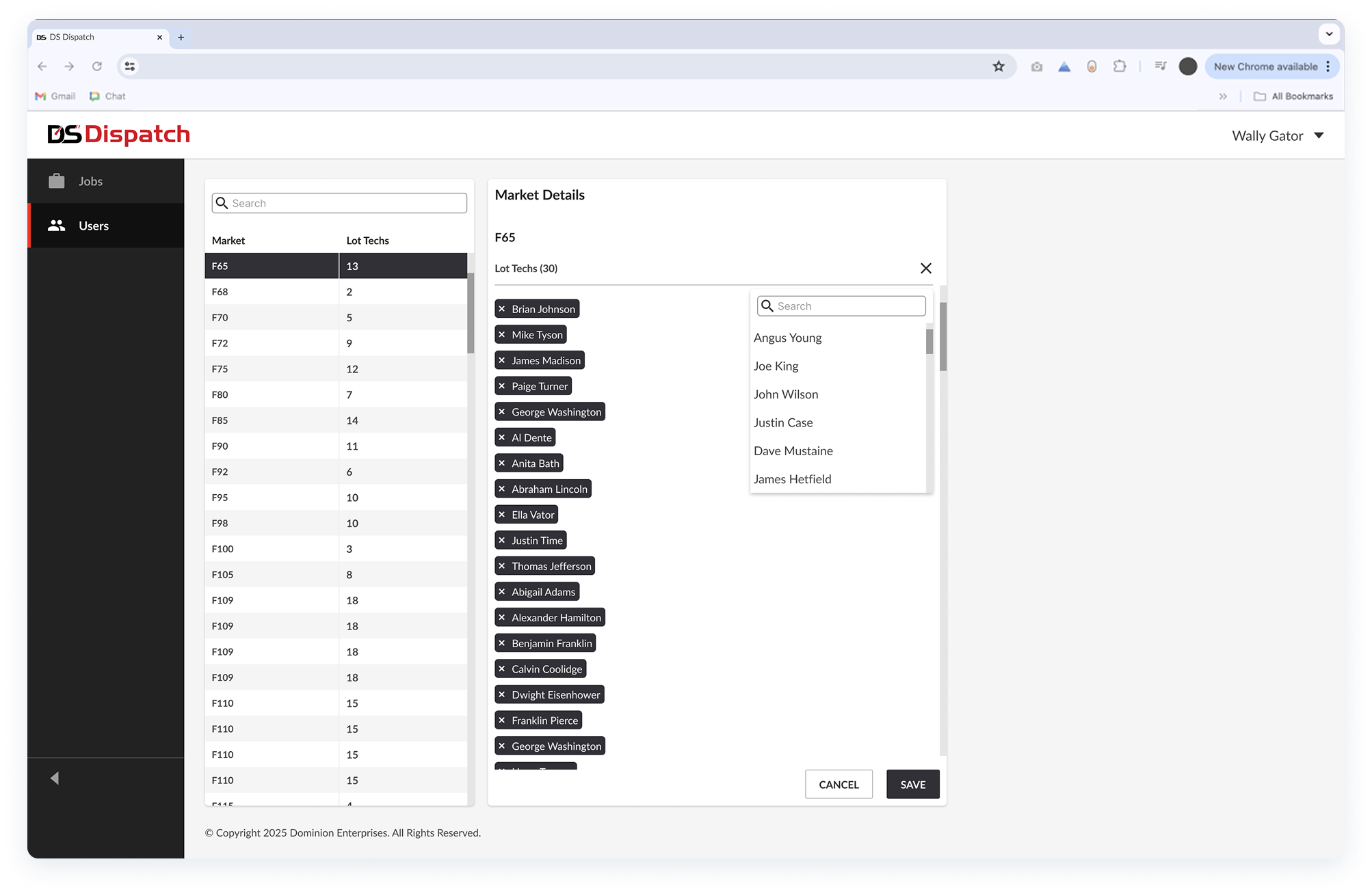
After the final testing sessions, I delivered high-fidelity designs for DS Dispatch, including a "Jobs" page for job scheduling/assignment, and a "Users" page for market and role management. These experiences integrate with the mobile app that lot techs use to view real-time job updates and statuses.

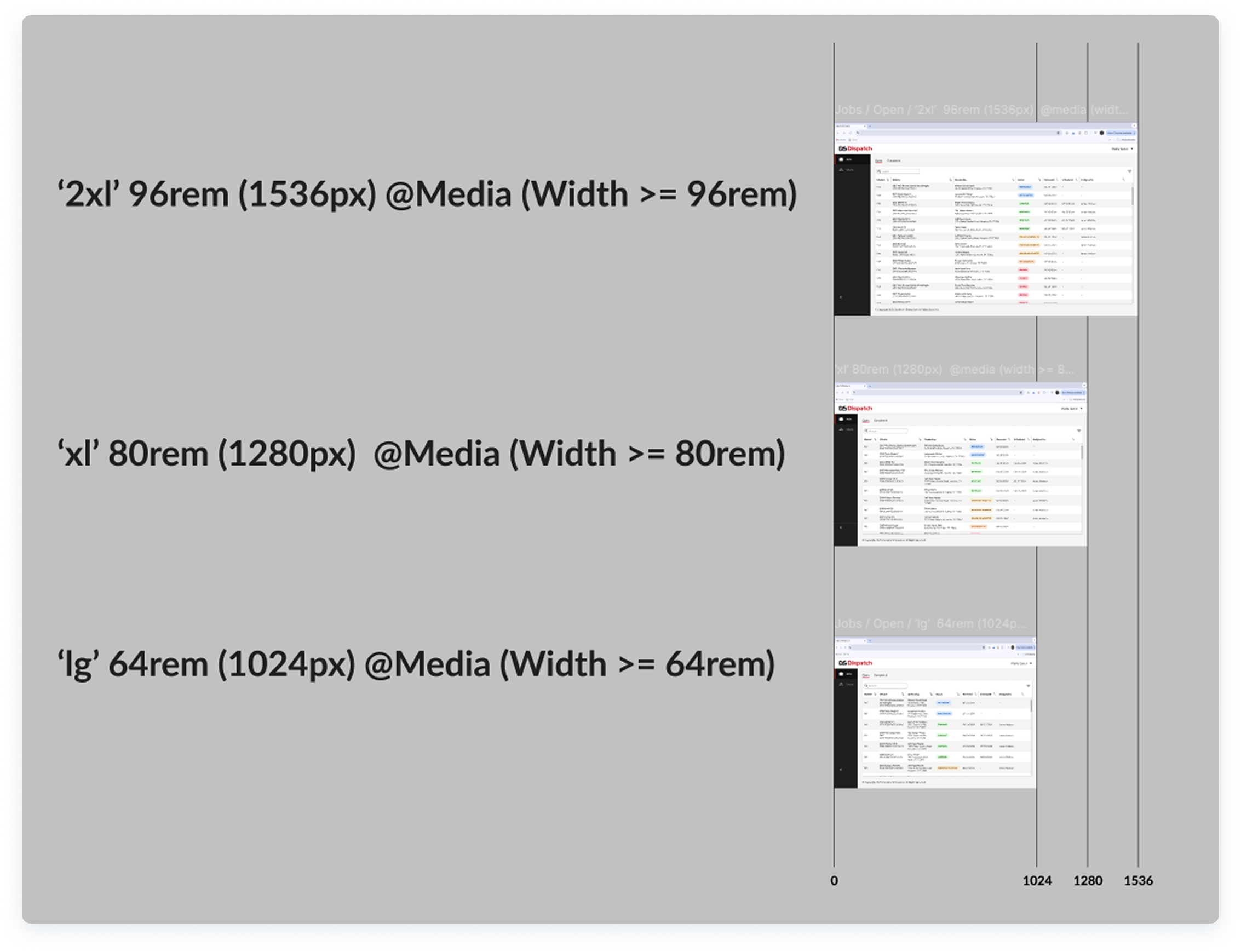
- Responsive frames and prototypes following Tailwind CSS to create the baseline for responsive behaviors, spacing patterns, and corner radius.
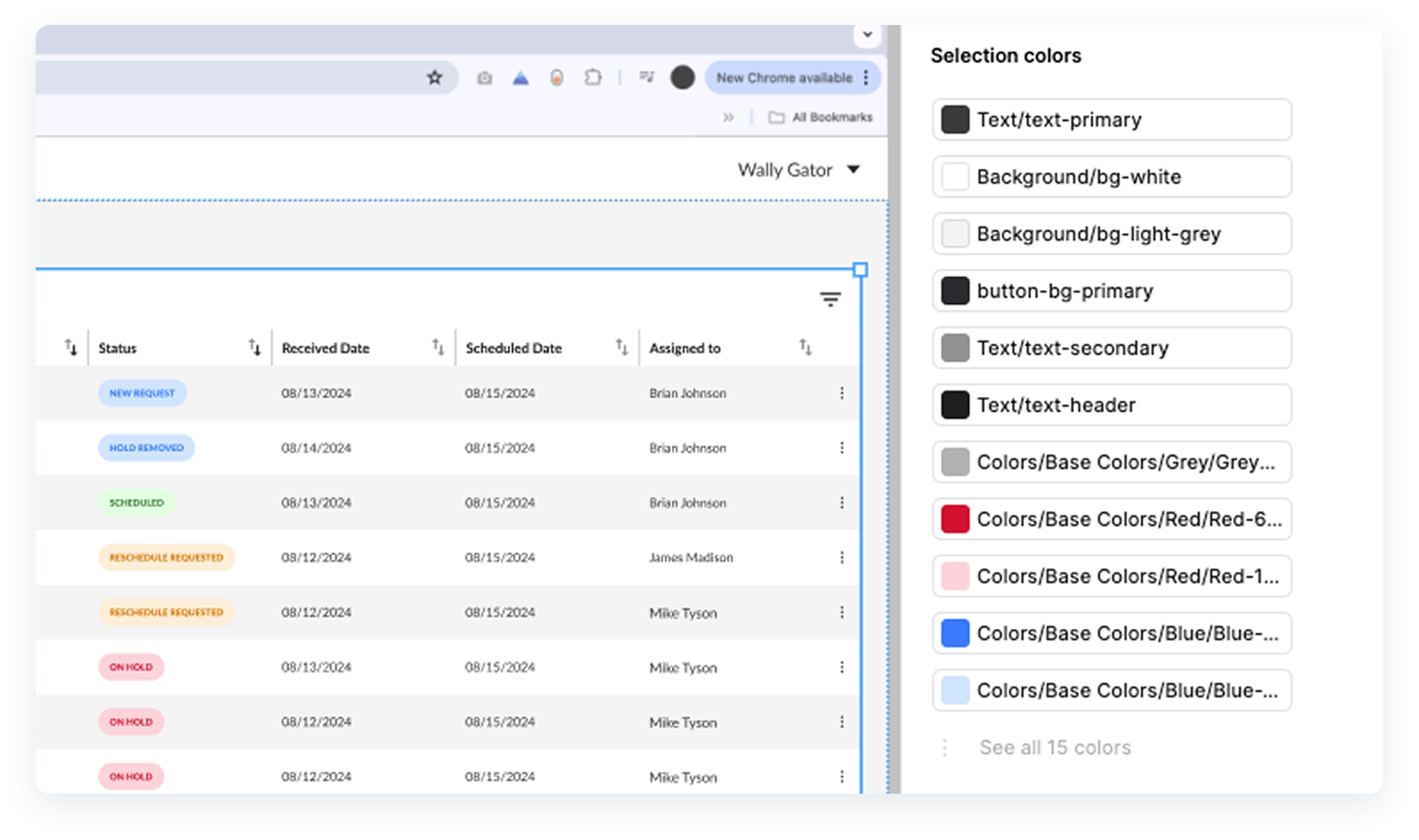
- I also leveraged our design system “Drive UX” and used tokenized colors for easy management and scalability.

- Final iteration of visual indicators to emphasize urgency and job status. These were specifically designed with Figma’s contrast standard tool to ensure they passed WCAG guidelines.
- Figma prototype demonstrating the user flow for scheduling and assigning a job with a "New Request" status.
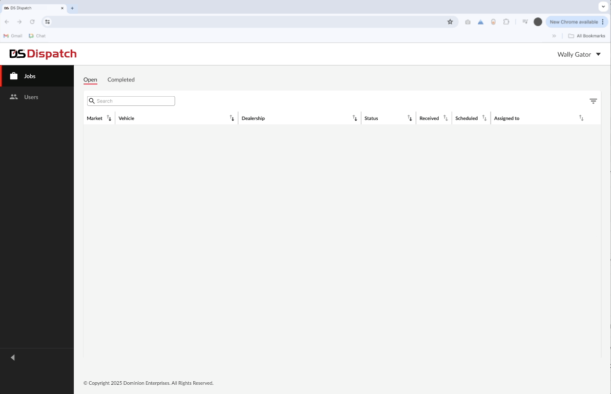
- I introduced ghost loaders to handle API response latency without disrupting usability.
launch
Impact & results
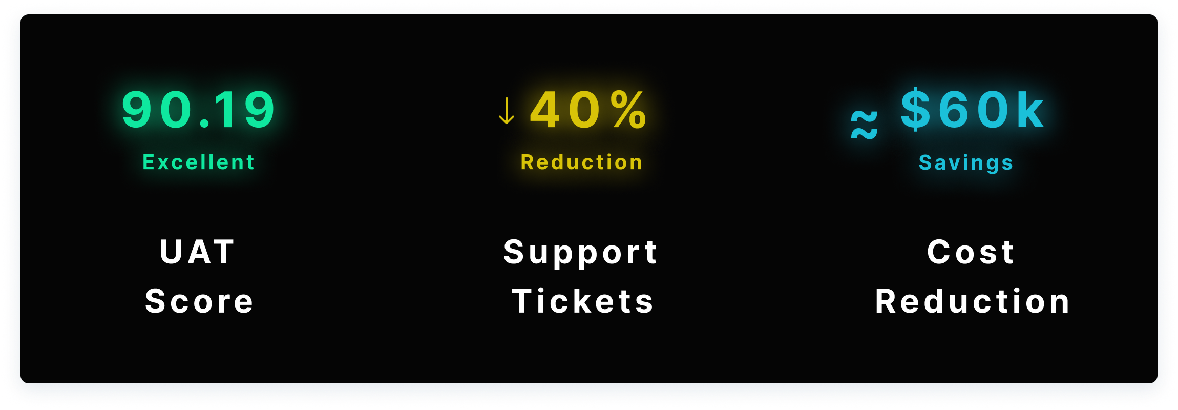
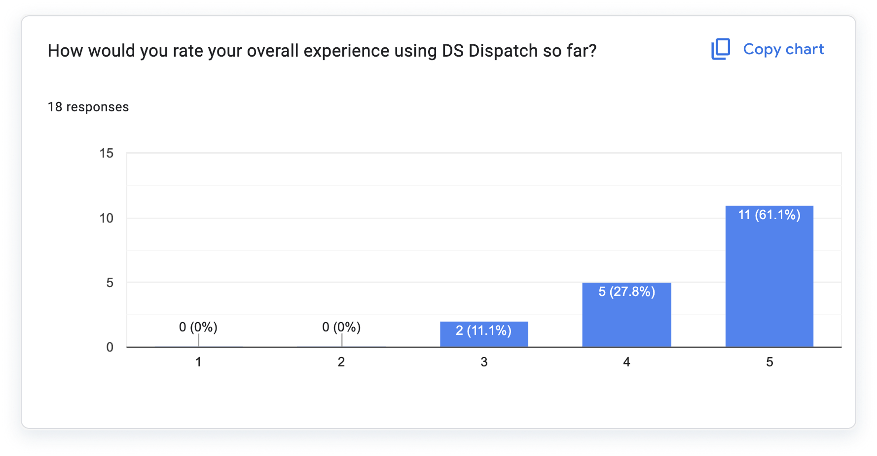
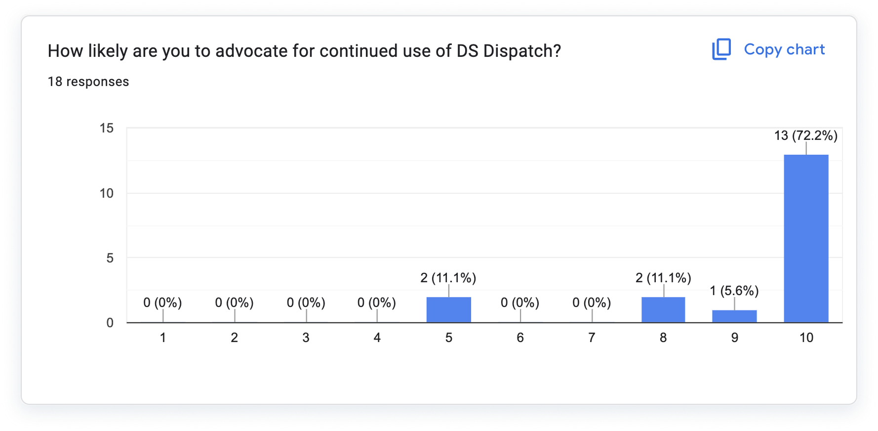
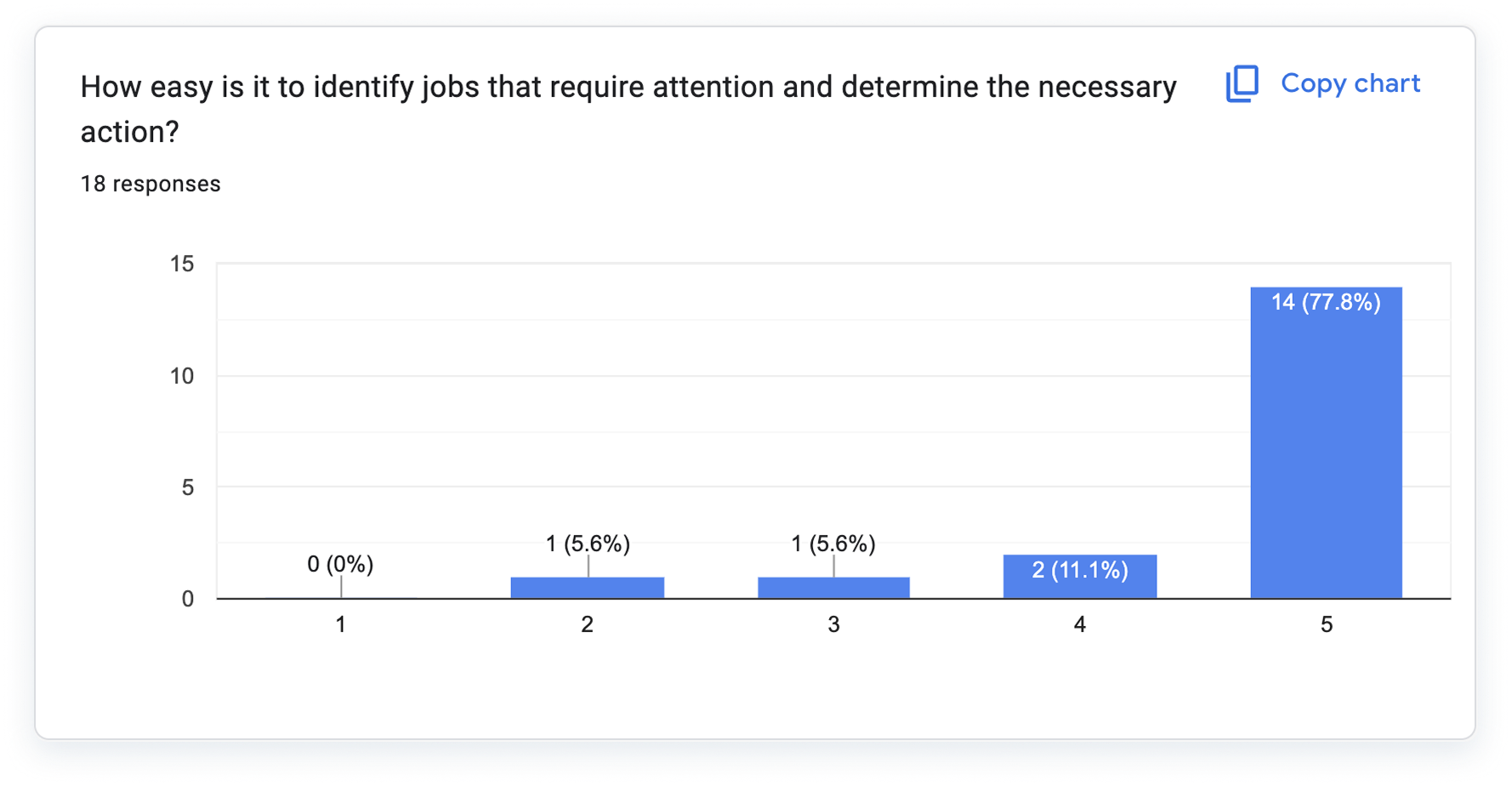
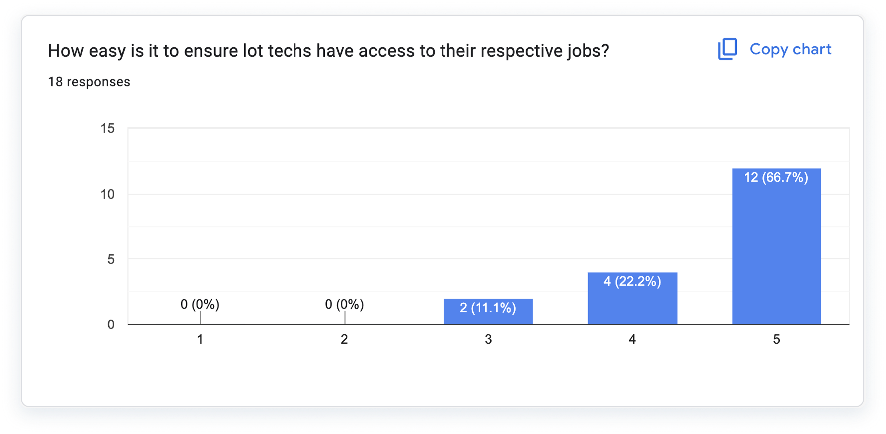
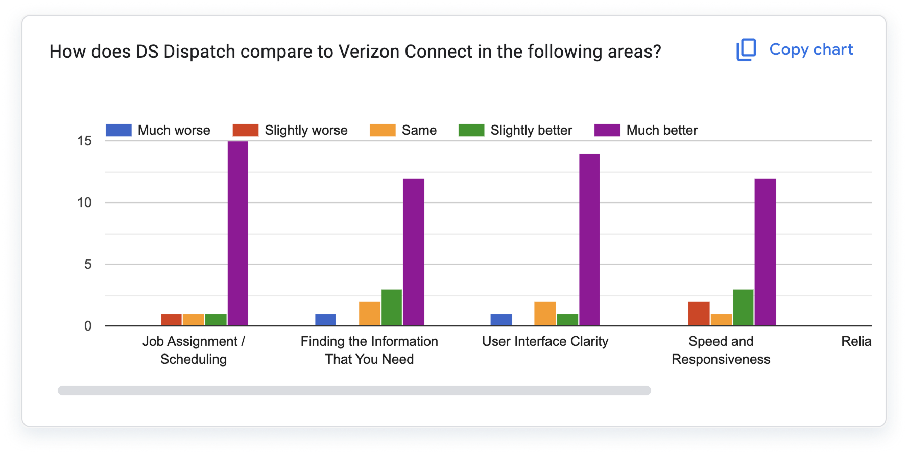
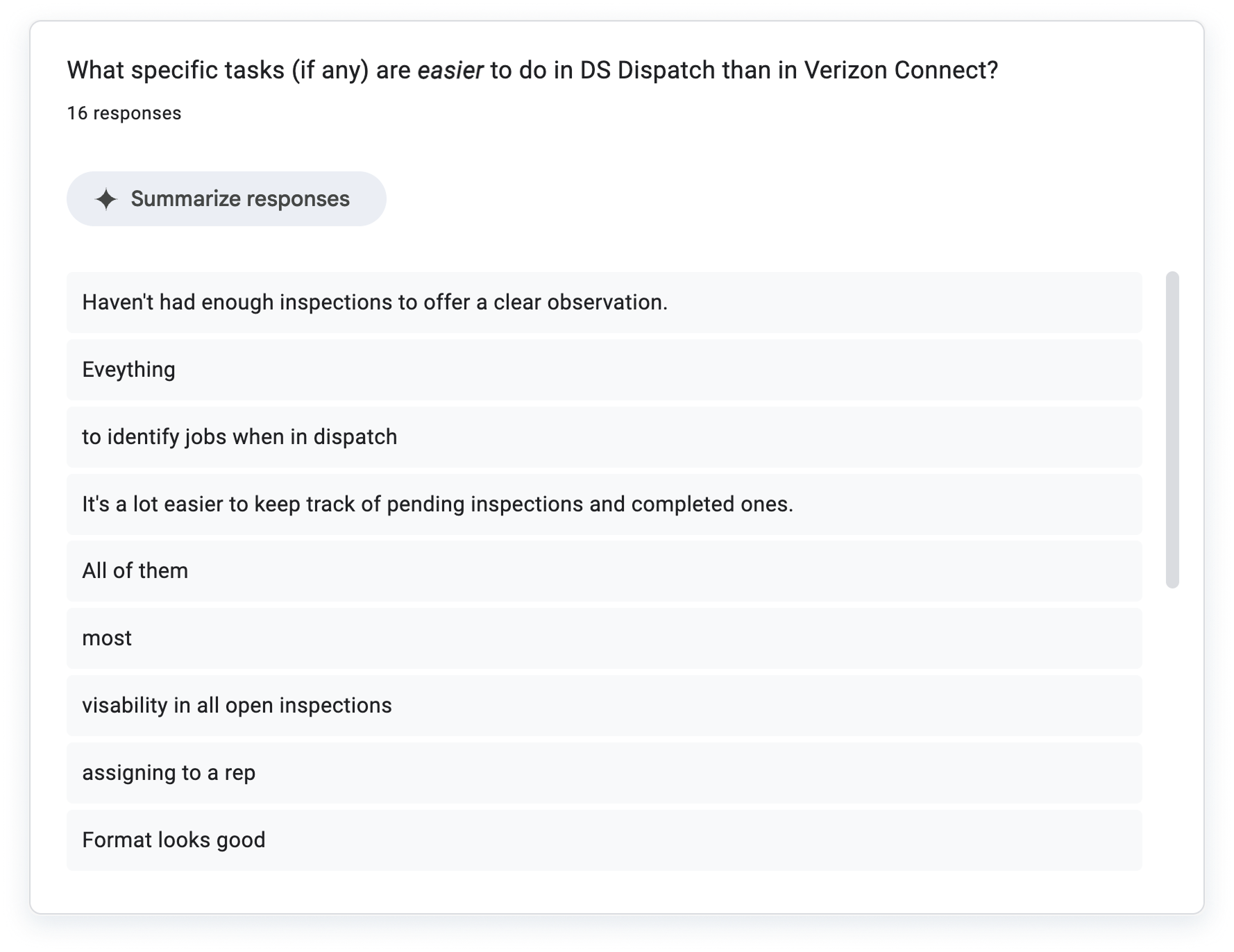
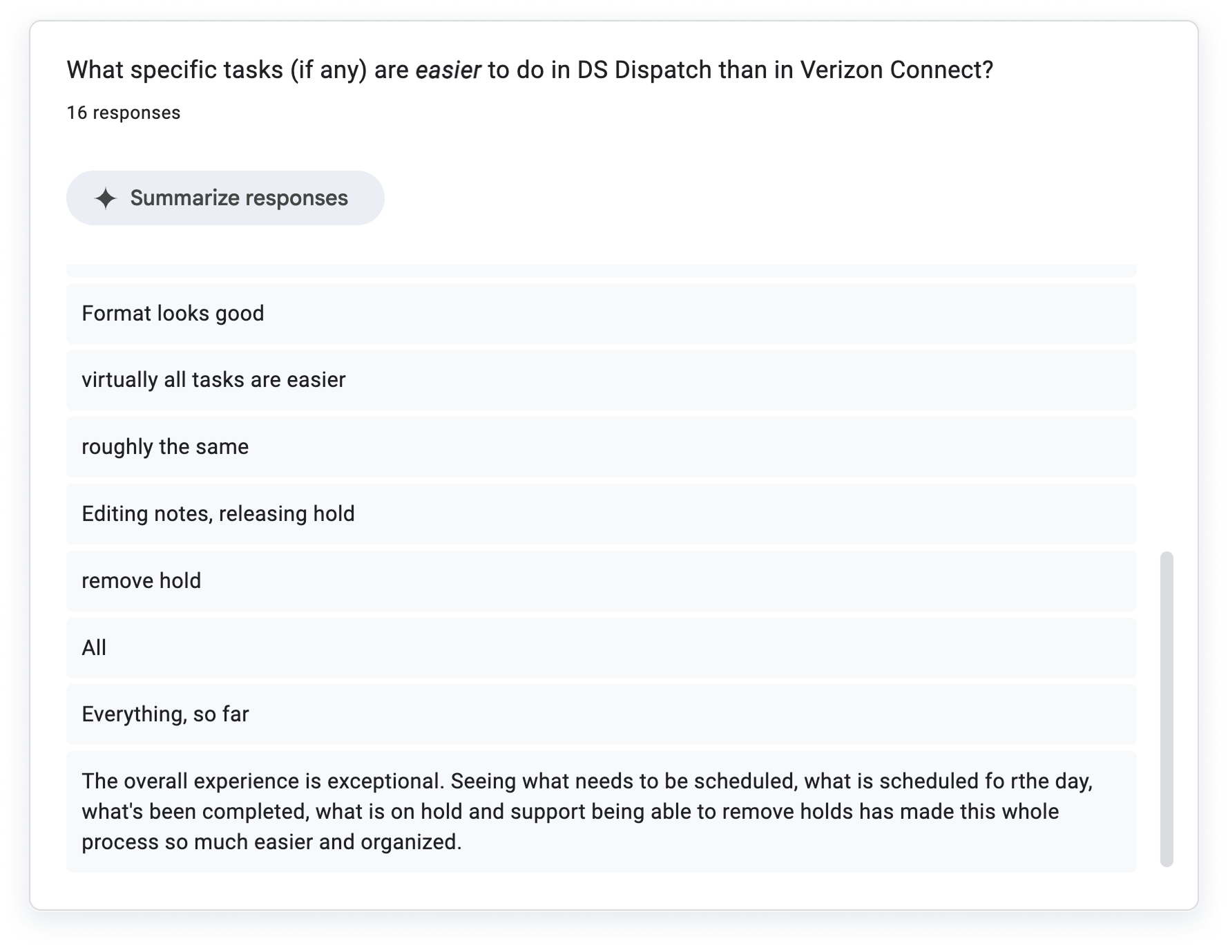
I partnered with QA and stakeholders during UAT to validate design decisions and ensure readiness for release. DSDispatch achieved a 90.19 UAT score, reduced support tickets by 40%, and improved scheduling speed and accuracy across teams, as well as saved the company an estimated $60k / yr.
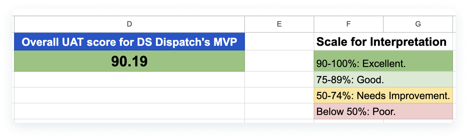
- Screenshot of the google sheet where I compiled all results and obtaiend this UAT score.
REFLECTIONS & NEXT STEPS
I learned the value of designing internal enterprise tools with the same attention to usability and accessibility as customer-facing products.
Scaling the "Drive UX" Design System ensured long-term maintainability, and close collaboration with users made the rollout smooth. Future enhancements include advanced analytics dashboards and deeper mobile integrations.